Q4. How did you use media technologies in the construction, research, planning and evaluation stages?
In 'GrveyardStudios' Media technologies is a very important aspect which helped us from the beginning, through the research to the post production as well as creating all our three media products. We used different media technologies at different stages. Weebly helped us create a website to store all our work on to. Final cut pro to edit our trailer and sound track pro to create the sound within the trailer. We also used technologies such as PhotoShop, Paintshop Pro, PowerPoint, Word, Excel, YouTube and social networking sites for certain things within the whole project.
Planning & Research
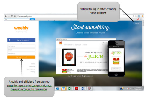
The first ting we had to do was create a Weebly page for the group so we would all be able to upload our works. Also the website we would be creating has to be very visual which meant we need our work to be visiual. In addition, in September one person ad to volunteer to be in charge of making the website look as good as possible, this was Sarah but along the line as a group we didn't really like the way it was looking so Abi and Belkis was put in charge of it.
Weebly page was fairly easy to use with the help of the element tab located at the top and side of the website. We used this to choose our theme from the many they had. To add images providing visual aspects o our work , titles to the top of each page , text explaining the work and supporting the images , YouTube videos, Buttons to link the sub tabs on the main tab pages , slide-shows, dividers to split our work on a page if there's too much work and columns to our page helping our coursework which was very important.
When we signed up to Weebly there was already a default banner there, however as a team we felt that the image on the banner was was too plain and didn't really fit in with the horror look we wanted on our website so we decided to make a new one.
|
Using Paintshop Pro an application similar to Photo Shop which i know nothing about, We created this banner which is simply a collage of weapons which are normally used in horror films. We liked this idea but felt that the images where to bright but wasn't really scary so we decided to change it.
|
This is an image of the second version of the banner. We decided to change the background to a single scary as well as change the font to one which fitted the slasher genre which our trailer is going to be about. However although the whole team liked it we felt that this wasn't exactly what we wanted our banner to look like so we made yet another attempt at this.
|

|

|
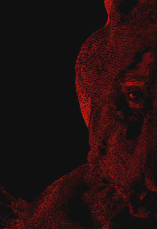
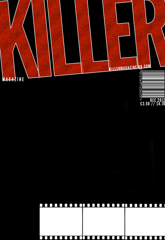
This is the final image of our banner which all agreed on. This banner was created using PhotoShop, we wanted our website to look consistent so we felt this is the only way we could do so because it is basically a banner of a poster of our film this is very efficient because it is promoting our film on our website we saw that this was something existing films do with their films.

Before the summer holidays we were asked to think of film our concepts which we could probably use to create our film trailer when we move on to A2 year which we individually created. PowerPoint came of great use to use to us when creating this because we could put all our information on to slides in order to present it to the class easily with the help of pictures as well as videos to keep our audience engaged. Through power point we could add images to the slide, change the font of our text as well as add things like background images and a link to a YouTube video.

Image from Abi's Concept
|

Image from Kayne's Concept
|

Image from Belkis's Concept
|

Image from Sarah's concept
|

Microsoft word really helped use with our textual analysis on the poster, trailer and magazine of our choice because we needed this software to write our analysis in order to ensure we were not making any silly spelling mistake or grammatical errors

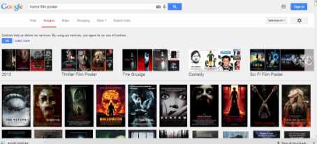
Google came of great use to us during our summer research as well as while we was writing our textual analysis. It allowed us to view existing magazines, posters and trailers looking at their conventions so that this way we would be able to input these into our own magazine. Working with Google was easy as all we had to do was type in anything we wanted such as 'horror movie posters' into the search engine and a whole load of images will pop up for us to use. We was also able to use this site to gain more information to put in our analysis through sites link IMBD or some blogs. A negative impact of using Google to search for information is that this is all secondary data so we had to look at more than one source.
|

|

YouTube is a site that allows billions of people to discover, watch and share originally created videos. Youtube aided us with writing the trailer textual analysis this media platform allowed us to watch hundreds of videos which related to our chosen sub genre in order to annotate it. It also came in handy when conducting our audience research because we were able to show our audience exact examples relating to what we meant so they will be able to visually view what we mean without any confusion. Moreover this media platform allowed us to view make up steps which is useful for when we are filming our trailer because no one in the group knew exactly how to create cut or even make fake blood but the videos we watched allowed us to learn in a easier way.

|

|

At this stage it was also important that we created a YouTube account for the group because we needed to make videos of our version of fake blood, as well as our videoed answers during the audience research stage and the anamatics we created. By uploading them onto Youtube we could then easily upload them to Weebly.
We created our video as using webcam to show the making of bruises quickly on Sarah face as this was the only way she could record properly as she didn't have proper equipment at home. We used an Iphone 5 to record the face to face interviews because Abi had previously recorded using a canon camera but lost all this because it wasn't saved onto the mac and had been deleted from the camera before she got back. Although the quality of this wasn't the best we could still see and hear what was said properly. Lastly we used a canon camera to film locations we felt we would be using in the trailer as part of our research. These videos came out in high quality both the sound and image.
|
|
|
|
|
|
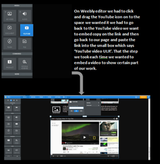
How to embed YouTube videos

|


|


|


|
These are a few of the media platforms we chose when asking questions for the audience research. For this stage in our research and planning we had to ask our audience questions that would be very useful to us when creating our three final products . We chose to ask questions on Facebook and Twitter because these are social networking sites with billions of users so it was guaranteed we would be getting back useful answers to help us. Whatsapp is an app on everyone's phone so this is an easy way of getting our target audience attention lastly we asked some questions through QuickSurveys because its an online questionnaire that allows us to ask question while using visual aid. Using these vary technologies allowed us to reach many different people who will be around our targeted audience in order to produce efficient final products that they would like to watch if it was in cinemas.

Photoshop came of immense use to us from the beginning of the project in the planning and research stage. Firstly, Abi thought the crews profile of the groups looked too bland so she used photoshop to create something different with the way the usual crew profiles are. In addition, all of GraveYard Studios Moodboards were created using Photoshop. Again we had to use Google to help us collect images which connotes our chosen sub-genre and treatment. Secondly, we used Photoshop to create our team logo it wasn't as easy as expected because we didn't want it to look too plain.
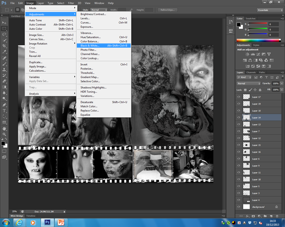
Photoshop allowed us to create loads of moodboards for our research stage. The moodboards we created varied from settings to costumes. From the previous year we had learned how to put a moodboard together using this software therefore it wasnt a big surprise to us. The mage shows a print screen while working on the make up moodboard; using an effect of black and white this is differnt as a make up moodboard would have loads of colour but i think the picture are well picked out for easy recongision of as the make up in a slasher trailer isnt as much.
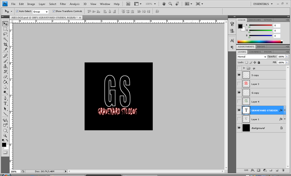
Here is the first step we took when making our logo we had a plain GS font called Impact with the writing of our team name in ..... font. This was too plain so we had to do something with it.

Making the lines the same colour as the graveyard studio so it stood out a bi more
|
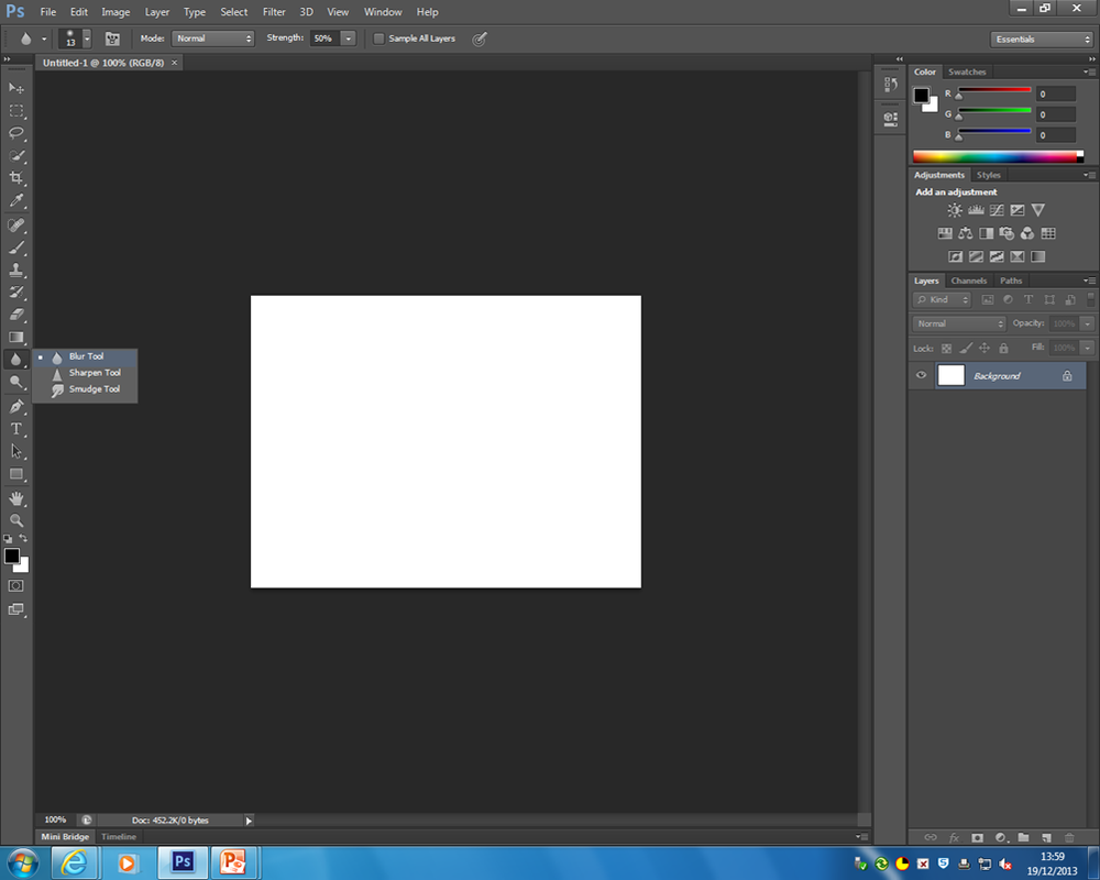
The blur tool on Photoshop meant we are able to easily blend the edges of pictures, with this all the pictures in the moodboards look like one whole image. Overall made our moodboard look really nice
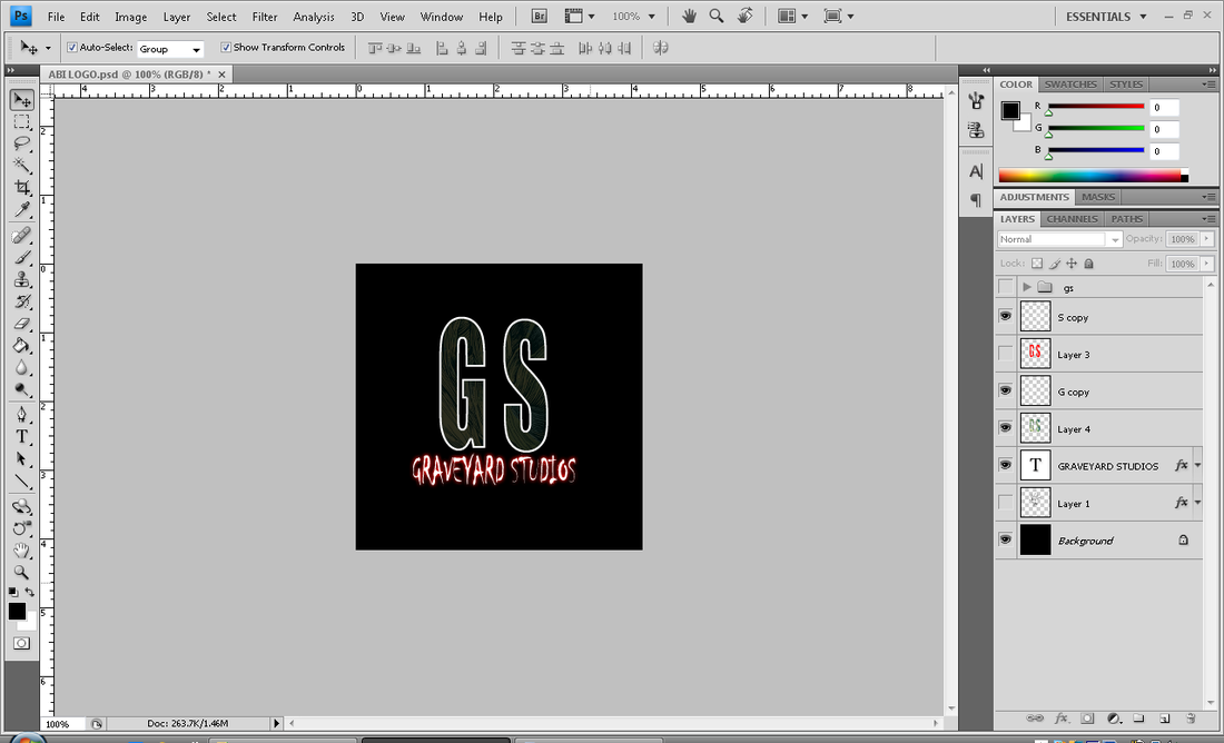
Then we added some lines to the back of the GS and put some shadow behind it, however yet it was too plain.
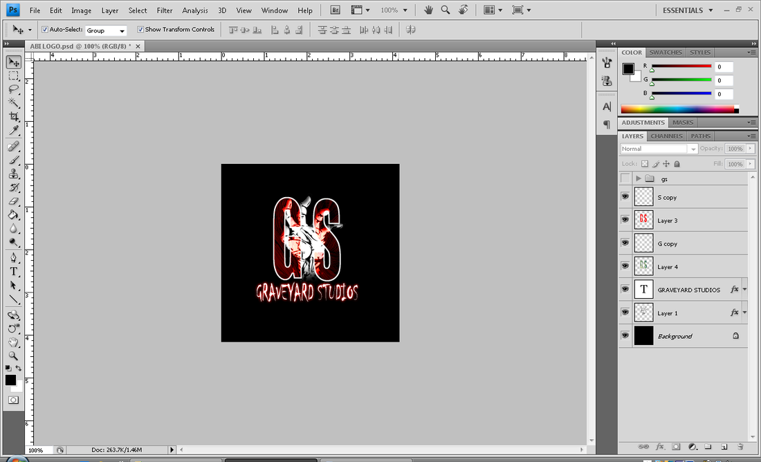
We found an image on Google which we put in front of the GS making it more like a horror film making studio
|

Sarah didn't know how to use PhotoShop instead she used PaintShop Pro to create all the drafting through the planning and research. Although not everyone knew what this was she made sure she showed us constant updates of what she was doing as she could only work on these at home and not in lesson.
|
We used Microsoft excel to create a poll which can be easily
read. of the votes we got from showing our concept to the class. This was easily done by Microsoft Excel because there is a easy button to click which changes data inputted into any chosen graph |


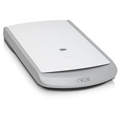
This HP jet scanner 5530 came of great use to our team because without it we wouldn't be able to scan many important images such as our animation and drafts. The scanner is connected to photoshop which we was able to use to crop each picture into sections before saving them individually as JPEG files.

Inspiration 1: Scream 2
|

Inspiration 2: Carrie
|
In class we watched many films such as 'REC' and 'ZOMBIELAND' however as a team we decided to go home and watch a few more Horror genre movie in order to get a more in depth knowledge of the Horror genre. when we came back as and spoke about what we saw in one of our team meetings to feedback to everyone which existing films were similar to the chosen concept. Some of us watched these films online while other watched it on DVD. The feedback we all gave was really good as both ways showed films with good enough quality and sound. However we found that it was easier to just watch the film online as its easier than buying/renting a film which could consume time while there is less time consumed when its online.
In the end we all agreed that the two films above Carrie and Scream 2 were most related to our our subgenre and storyline as Carries is about a girl who is bullied like the Protagonist in our final concept and scream has teenagers being killed off one after each other which is similar to what we pictured our film should be like.
In the end we all agreed that the two films above Carrie and Scream 2 were most related to our our subgenre and storyline as Carries is about a girl who is bullied like the Protagonist in our final concept and scream has teenagers being killed off one after each other which is similar to what we pictured our film should be like.
Production/Filming
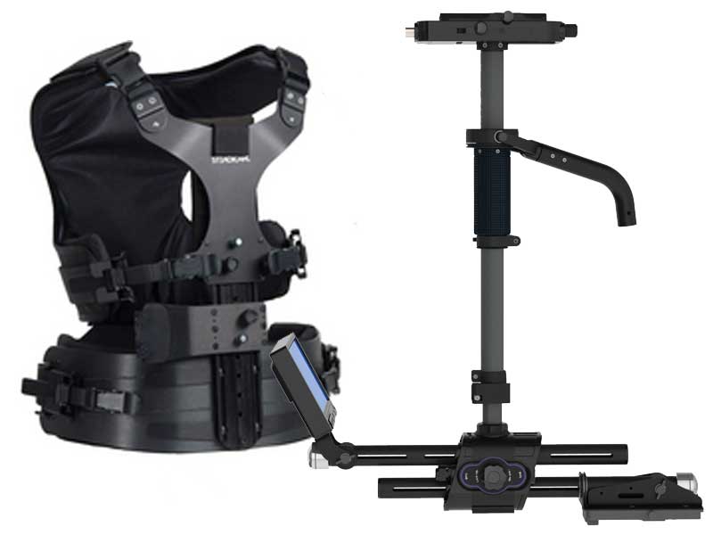
The lead up to filming our trailer; we had to learn and test many technologies with regards to the equipments will want to use on the day of filming our trailer. This was a good opportunity because it meant we will be able to try out things we already knew how to use like a camera and tripod to a piece of equipment we didn't know how to use like a Steadicam. As a team we all tried on the stedicam and tried to film with it while walking so that we know who the Camera person will be on the filming day. The person who filmed the best with the least amount of movements was Kanye so we decided he would handle the camera on the day.
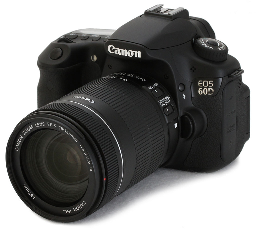
Canon EOS 600D
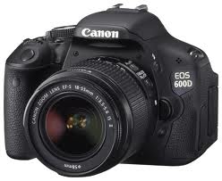
The camera we used to film our trailer and take pictures for the magazine and poster was a Canon EOS 600D camera. This camera was one equipment we had already learned how to use during AS year coursework to take images for our music magazine, although we already knew how to work it we had to learn a few new things as most of us forgot how to operate it. We took all the images used in the magazine and poster in the studio against a black background because we thought a white background wouldn't be as effective for the subgenre our storyline was. Before the filming day we had to read up and research certain things in the camera because we wanted our shots to be really clear and not grainy then again we tested these settings out on the camera. The camera was 18 megapixel, we took our shots in 25 frames per second, the sensor size and type was 22.3 x14.9mm CMOS, The ISO we used for our shots were 200 and 400 but the shots outside were taken with 100 ISO to make the shots darker and the shutter speed is how quickly the camera picks up light and we used between 50-100 for this.
Stedi-Cam
|
Another equipment we used while filming was a Stedi-Cam. A Stedi-Cam is a brand of camera stabilizer mount for cameras that mechanically isolates it from the users movement. It allows for a smooth shot, even when moving quickly. We decided to use this because towards the end of our trailer ,we wanted a shot showing one of the victims running and this was one of the ways we could get a clean shot while running backwards.
|
Sony Tripod
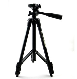
The use of a tripod is so that it keeps the camera steady while we are filming, as opposed to using our hands because we found that when we shot using our hands there was always a slight jerky movement and this made the quality of the shot less. We also used this equipment because on our panning shot which needed to be clean in order for it to look nice, we used the handle of the tripod to move the camera left to right showing an establishing shot of the college, With the use of the tripod it helped us keep the camera steady. Using the tripod was quite easy because Abi had previous experience outside college using it so it was we had no problems setting it up during the testing and on filming day.
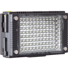
Kino Flo
|
Kino Flo is a lighting equipment for use in motion pictures it is best known for its fluorescent tube-based systems that are optimized for the color temperature of film and digital video. These lights provide a relatively efficient way of providing soft lighting. we used this in the making of our trailer . We used this once in the classroom scene footage because we found that the lighting in the classroom was too dark as we wanted to film in the dark since the students are meant to be watching a film we couldn't have the lights bulbs on. We had to position this equipment on the side of the main character in order for us to really get his facial expression.
|

|
Kailite Lights
|
Kailite is also another lighting equipment we used for a shot in our trailer. We two sets of light positioning it at either side of the characters face in the storage because although we wanted the surrounding to be really dark we wanted to be able to see the characters facial expression while she was being attacked. These lights are really useful because they are small and we could easily move them around to please what we wanted the footage to look like.
|
|
Microphone
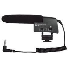
We used the microphone when we felt that it was important if we re recorded the dialogue part of our trailer because the dialogue was too low and we could hardly make out what was said. We simply had to connect the microphone to the Canon camera and have the characters talk again. Using this was pretty straightforward as it was basically the same steps as videoing.
Print Production/Advertising
When we first stared the planning and research stage we knew that it was a vital aspect for us to look at existing magazines and posters to view the ways that they choose to layout and present their products. Using Google we searched for posters and magazine which had similar story lines as well as sub gene in order to gain a full insight to where to begin with our final print products.
|
MAGAZINES
|
POSTERS
|
After all the needed research has been carried out we had to draw some mock ups for our print products. We need the help of a media technology again, which was the HP Scanner to scan the mock ups in order to put these on our website to show the progress we keep on making with the drafting of the print products
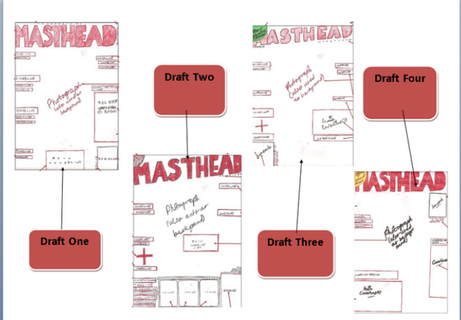
These are hand drawn drafts which simply has boxes in postions of where the different elements a magazine front cover must contain, following the conventions of existing horror magazine.
|

|
Following the drawn drafts to left we then thought it would be useful to have a futher drawn draft of magazine with drawn images that are coloured which will reprenst the type of images we would like in when we make our own magzine.
|
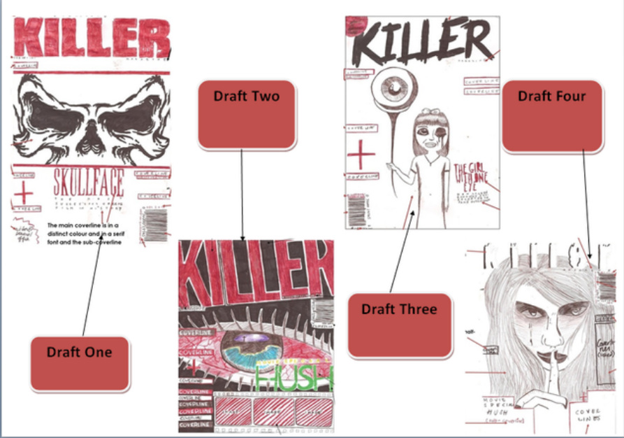
These are hand drawn drafts of four different posters. Again we chose to create drafts which only easily showed the positioning of the conventions of a poster that we will be following, using the existing poster we had researched on.
|
These are the yet again hand drawn drafts which shows in a better way the ideas we have for our poster. These allows us to get a better understanding of thge type of shot we will be taking the main image. As you can see above these shot types varies from extreme close-up to long shot.
|
|
|
|
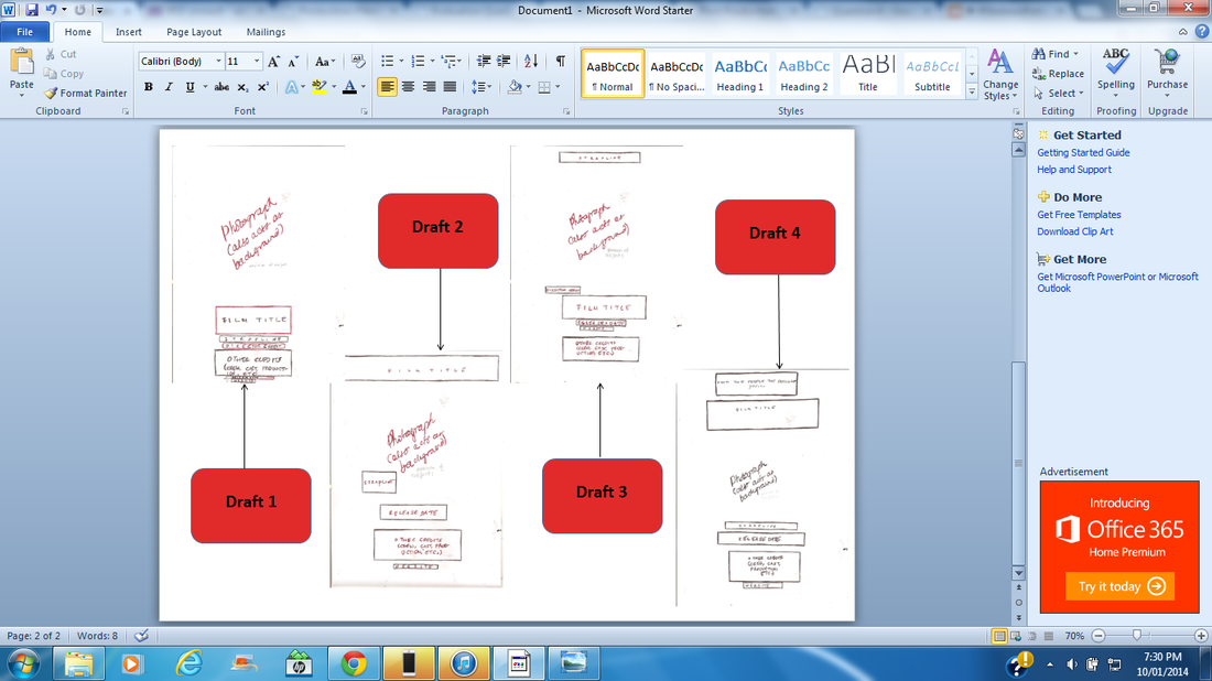
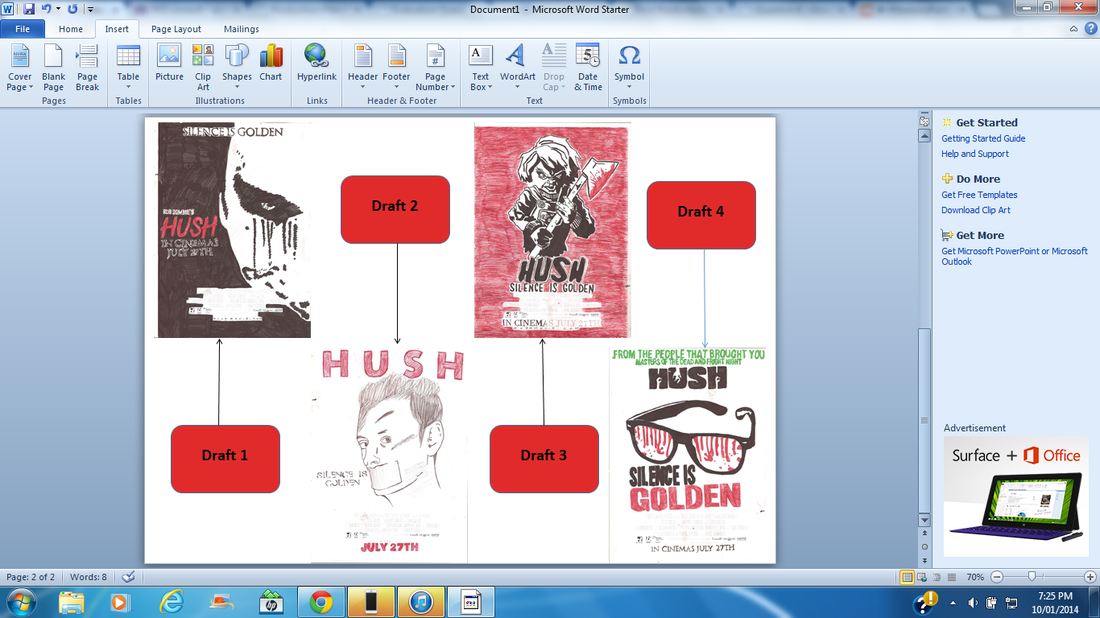
Next we also thought it would be very useful and allow us to easily know what we are doing if we created final drafting for these four different magazine using images we find on Google that can help us realise the type of shot we would want to use when we moved on to the photo-shoot as well deciding the layout we wanted for our final magazine and poster product. These drafts of the poster and magazine shown above were both constructed using Paintshop Pro by putting an image behind found on Google editing the images a bit and including some text.
|
|
Next we had a photography session which everyone in the team was needed at the shoot because we wanted to all agree on the shots and expressions in the images that we will be using in our print products. We took these photos in our spare when everyone in the group was free also we finalised on taking the images on a black screen becasue we thought this would have a better effect with the slasher genre we was going for in this photography session we needed
These media technologies were very useful for use at this stage once again because without them we would not be able to take effective pictures to use to create of final products. We used the camera to take pictures, the kino flash kit provided the right amount of light while the tripod kept the camera steady while taking pictures.
|


The first thing we had to do when creating the poster was edit the main image becasue we felt that it was too brightly lit and wasnt scary enough. Through paintshop pro there is an effect called red wax that we clicked to and done a few alterations to to change the whole look of our main image
We added the credits to the bottom part of our poster and included quotes from a magazine and newspaper review, this shows the audience that the review for our film is good hence giving them more reason to go and watch the film if it came out.
|
We then added our Film Title and coloured it in red because we could use black as it would blend in with the background also we thought a white title wouldn't be as effective with the main image. Adding the film release date makes our poster even more realistic because usually a main poster wants to draw audiences in so telling them the release date makes them more anxious to watch the film.
Finally here we have included all the conventions a poster should have.These includes the films website, a certificate stating what age the movie is for. some production companies who may have funded or help when making the film.
|
The magazine has already had a good idea of the layout from the paintshop pro draft so we just removed the image behind the draft and all other unneeded items.
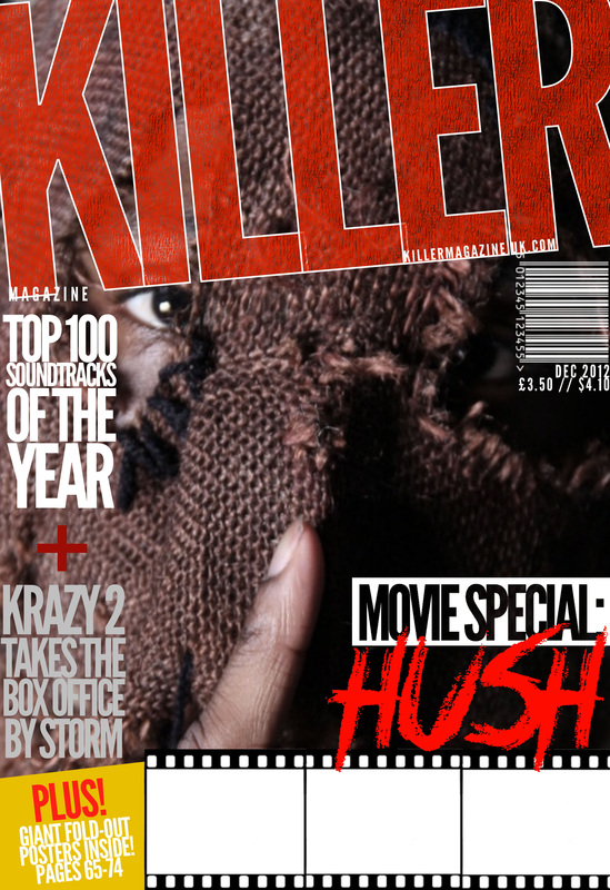
We added the different cover lines at the side of the magazine following conventions which existing magazines had.
|
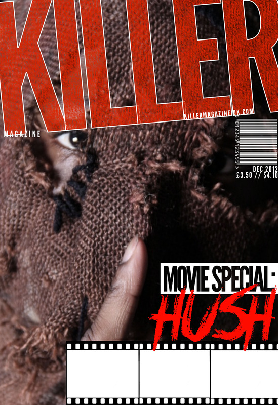
We then as a group chose this image to use in as the main image. We changed the font of the film title as we all chose the font instead as it was one thing our target audience said they liked during the audience research we took
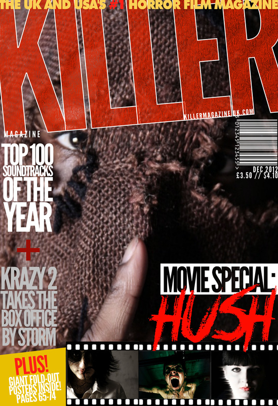
We added a selling line as it was one of the first things a reader of the magazine would see. The pictures of existing films are also along the bottom of the magazine giving the reader visual image and not just writing which could attract them to buying our magazine.
|

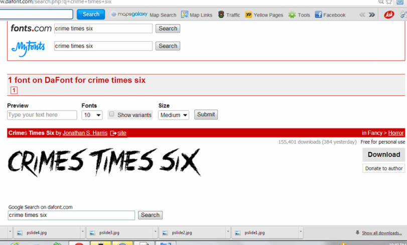
Through Dafont.com a website we found on the internet which allows us to download many fonts that we could possibly use in our products. This site was very useful because it had thousands of fonts we could pick from which we though would fit the slasher subgenre. We had previously showed some audience different fonts we wanted to use for them to pick one that suited our storyline. We chose 'Crime Times Six' because of the way the sharp pointed ending looks like a sharp object ususally used in a slasher movie. Also the font kind of reminds us of something painted on in a hurry like blood when its in red.
Evaluation (Post Production)

Final Cut Pro is a software we used during the post production stage to edit our trailer; it allows us make as much alterations to the footage as we wanted. We was able to cut specific part of the shots we wanted out of the ones we took, we was able to add many diiferent transitions and effects
When it came to editing our trailer unlike many students we chose not to follow exactly the previous work we done creating our anamatics. The reason being as a group we felt that our anamatics wasn't our strongest point because firstly the amount of shots that was in it was quite small and we thought in order to make a better impact on our audience it would be better if our trailer was longer. Secondly on filming day we decided to shoot some extra shot which were not included in our anamatic but felt that it would make our storyline more interesting. So we had to change the order of shots as well as some of the shots we had considered to use.

The person put in charge of editing had to pick the shots we wanted from all the ones we took on filming day because we done a few retakes so we had the options of picking the best one. We then imported these clips into final cut pro to start editing. The imported clips look like this and allowed us easy access to them.
|

We then dragged the clips on to the timeline pictured above. this allowed us to manipulate teach clip depending on the one we clicked on enabling us to add different effects which we thought would be effective in helping to add to the scare factor and giving our trailer a professional look.
|

|

|
One effect added to our shot was used vignette which is under the effect tab located at the top of Final Cut Pro under the name...... This effect was really good because it help give our footage a more professional look. We then copied and paste this effect into all the other shots in order to have continuity of the effect through the trailer. However, we realised that for the shot taken inside this effect made everything darker so we had to go back to the ...... tab were we could change the......

Another effect we added was 'bad tv' this was recommended to us by our teacher as we didnt know where to locate it at first so when we tld him our vision he told us ho to dind it on final cut pro. This effect added a sort of crackling effect to our establishing shot as we thought it was quite usual having a plain old panning establishing shot.
|
By right clicking on a selected shot. we was able to change the speed of that specific shot which we thought was important for this punch scene because we thought it made the clip too long although we wanted the whole shot.
|
|
|


As we wanted to follow the conventions of any existing trailers we felt the need to include captions into our trailer. Firstly we decided to use a background of hessian . which was the material we used for our Antagonists mask . We thought this would add to the continuity through our trailer. We then used the ...... tab to add a vignette effect again but this time we used three layers of it. In addition we lowered the opacity of the background to give a darker more edgy feel to our trailer. Next we created our captions at first we wanted a thick font which most trailers used but then when we tried this we felt it didn't suit the theme of our trailer hence we went for a San Serif font called ......... this almost instantly made a huge different to the look . Changing the colour of the font from white and adding an effect called 'brightness and contrast' and adding a drop shadow made the captions fit the background better.
|
Transitions is another important element with a teaser trailer that helps a lot to add some startles to any audience. We added some fade ins and fades out as well as just a sudden black screen at the end of a shot. The sudden black screen i would say has the most effect because it meant that the audience as the audience are unaware of whats going to happen next it might cause them to jump a little. This particularly works when the masked face appears right after a black screen.
|

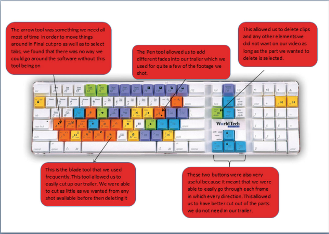
This is an image which explains the tools i used in Finalcut Pro to edit our teaser trailer. These tools allowed using the software very easy and quick to learn about as we had not used this programme before.
The next stage of creating a teaser trailer was to find and choose effective sound which work extremely well with the editing that has been done. Prior to making the trailer someone from the group was chosen to go and research on some sounds we could possibly use in our trailer. We were then introduced to the software as he or anyone else in the group used this software before. Soundtrack Pro is a music composing and audio editing software created by Apple Inc. There are different sound which can be located on this software already. While we found some useful one we couldn't find sounds which were effective enough to use through all the trailer, hence we found a website where we could download sounds from the internet for free.
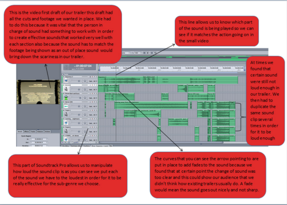
This is what the timeline and the surrounding of Soundtrack Pro for the sound we had created. The image annotates certain features we used in the aid of creating the final sound that can be heard when watching our trailer.
When we finished importing the sound back to our final edited trailer we were then able to convert the trailer into a QuickTime file which enables us to upload it onto our Youtube page before posting it on our website.
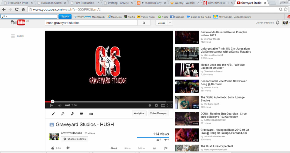
Internet was the main source used to market and distribute our three final products. YouTube is a very useful source which we uploaded our trailer onto in order to collect feedback from people who had watched our trailer as well as gaining feedback with regards to the positives and negatives of our trailer. We are also able to see the amount of people who liked or disliked the trailer.
|
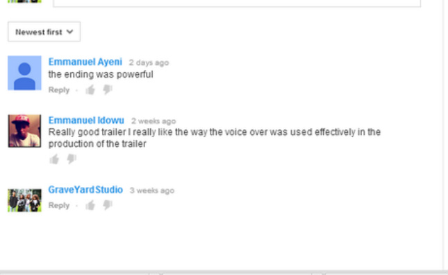
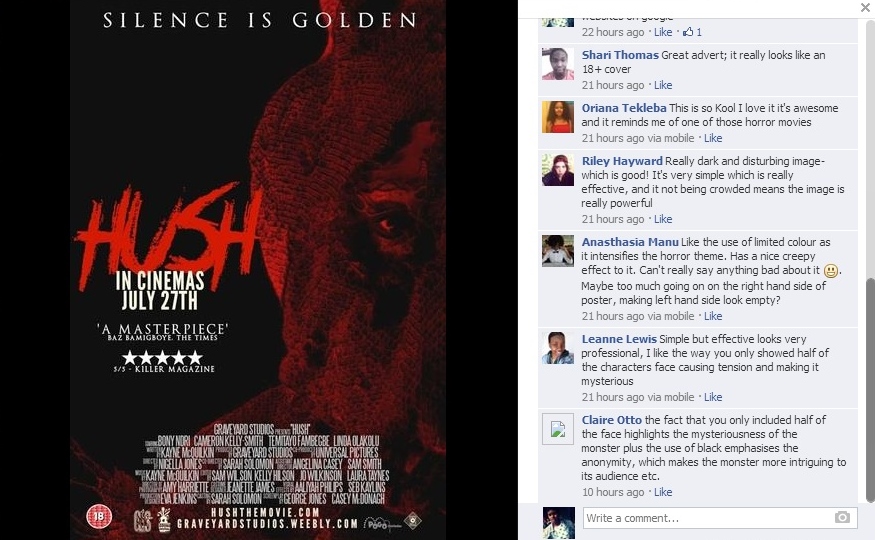
We managed to get a few comments from people who had watched our trailer we found that they where all good constructive comments which could possible help us if we were to make this trailer again.
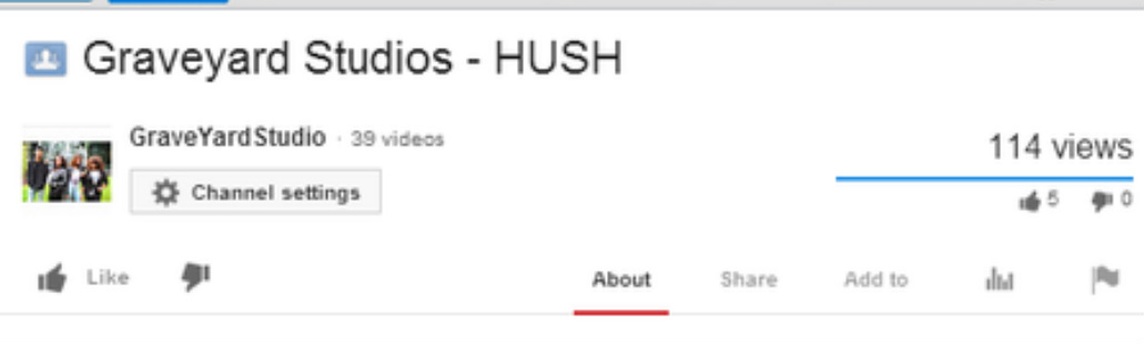
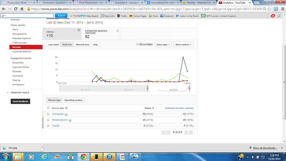
We had a total of 114 views from when we uploaded our trailer and 5 likes and 0 dislikes. Using this 'share' button we are able to share our YouTube trailer through various social networking sites in order to allow people on these site to see a notification of our video on there wall and maybe even watching our Teaser trailer.
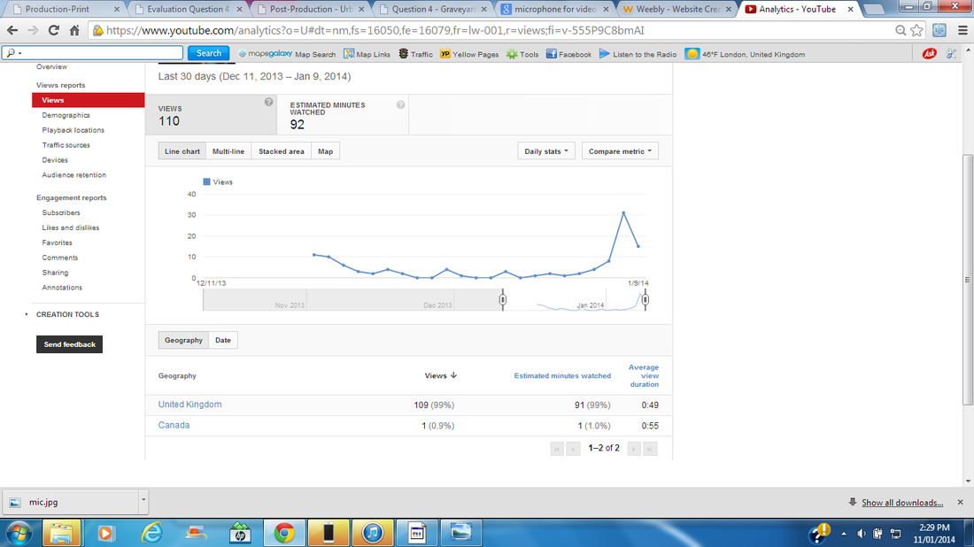
We were able to get some statics through youtube regarding the views this is a very good way for us to see how well our video is doing with the amount of people who watches it. This showed that our video was not only seen in the UK but also in Canada.
|
With the image below you can see the different media technologies that our video was viewed from; computers, Phones and tablet. These technologies like the phone and tablet are what makes things easier for our target audience. It means they would be motivated to watch our trailer as it is within there reach.
|

|

|
|
Social networking sites have billions of people who go on it on an everyday basic. Sharing our final print products on Facebook meant we could show all our work to everyone and this way we would be able to gather feedback from them with regards to how well they think it looks and any improvements that we could make. We got back good and constructive feedback which we can use for to answer the evaluation questions. Also Facebook we are unable to use this in college so we have to use this at home to get back our feedback
In conclusion, media technologies is extremly important to us in this era without media technologies we would not have been able to construct any of this project or work as all the vital parts of our work needs us to show certain things giving evidence that we have done the work. If the coursework was merely speaking in front of our teacher we would have been able to do so without any need of media technologies but it is as we needed things such as, Microsoft word to write, Photoshop and Paintshop Pro to edit many images and to create our final print products, Social networking sites to gather feedback from our audince and most of all the internet using a computer as without it we wouldnt be able to upload our work or search for any thing. Overall, This project as allowed us to not only work with others in a team although we did not always agree on the same things but also gave us a chance to work with many equipments we had no previous experience with which is some experience some of us may not have an oppotunity to have again as we move on to University.
