
FANGORIA(KAYNE)

Masthead: The title “Fangoria” is Witten in a font that makes the title look like a pair of fangs which coincides with the name of the actual magazine this also gives it a “Horror” feel.
Main image: There’s a mid-close up image of a vampire from the movie Jennifers Body as is suggested by the main coverline. The vampire is also looking away at something out of shot which may suggest it’s looking for new prey.
NVC: The person in the image is covered in blood this is very relevant as it suggests the vampire is violent and attacks people this helps enhance the scary image unlike something like “Twilight” where the vampires don’t seem very scary. The person in the image looks like they have just finished feeding and are looking for their next victim.
Lighting: The image has very low key lighting in the background with the vampire almost looking like it has a spot light on it this connotes that the vampire is meant to be the main focus of the cover.
Dateline: This Is the month and year the magazine was published.
Coverlines: The cover lines are written in Red and White the red connotes blood this is effective as it’s a horror magazine. All of the coverlines are also horror movies that are either out or coming soon, such as “Grace”
Main coverline: This is quite large as it is the main thing the viewer is meant to see and be enticed by, it is also connected to the image on the magazine most of the time in this case it says “Jennifer’s body” and the main image is a vampire from the movie. The image and coverline together are there to promote the movie and make someone want see it.
Target Audience: I believe the main target audience is people within the age of 16 – 25 as the cover is quite graphic and gory and I think a younger or older audience will find it quite scary and provoking.
HORRORHOUND(ABI)

Textual Analysis: Magazine
Masthead: The masthead on this front cover is HorrorHound. Its s placed at the centre top of the page in bold San Serif typography and is the biggest writing on the whole page. These features are what catches the readers eyes at first glance moreover enables the constant and new readers of the magazine very much aware what film genre the magazine is on; which is horror. The typography connotes that the magazine may be of the Morden era which could also help in attracting younger audiences. The colour of the writing is red and red is a colour that is usually used to represent horror; this also links with the main image
Mise-en-scene: Props/Costumes: I would say the pros and costumes used are the mask with is worn by the doll and on the side of it there’s Jason’s mask. These all hide the face of the killers in the films. This represents there may something mysterious going on. In addition the clothing worn by the main image and other images are dark and this is right for the genre of magazine as it would be weird and unattractive if they were dressed in bright colours.
Lighting: The lighting of the magazine is low key connoting something dark and adds tension especially for the magazine genre.
NVC: The NVC looks evil and piercing connoting that he is someone not to mess with and stay away from as much as possible.
Text/ Typography: The typography used is mostly san serif font with represents how modern the magazine is. There are also a few fonts which are written in a bloody font this conveys how gory the things in the magazine would be. Moreover it connotes the amount of blood that is shed in the movie of the main image.
Dateline: The dateline of the magazine says winter 2006-2007 this let us know when the magazine is published and it somehow also creates tension because it is published in the winter time when it gets dark quickly and is very cold. This may help excite the readers of the magazine.
Main Image: The main image is of a well-known doll used in the Sae franchise so this can be easily recognised by any of the magazines audience. It is a close up shot of the dolls face with a smile this connotes that the doll may be mischievous for those who don’t know it, drawing in people to find out more about it in the magazine. By using a close up allows us to see that the doll is looking directly at the audience and this creates tension which is normally around when watching a horror movie.
Main Coverline: The main coverline is located at the bottom of the page. It is the second biggest on the page after the masthead. This coverline relates back to the main image of the dolls face that is used in saw. It say “Let the games begin”. This interacts with the audience because they would already know the type of film saw which is playing mind games with people and would attract them to buy the magazine in order to find more out about the film.
Coverlines: This magazine doesn’t really have any coverlines and I think it is used effectively because they already have a lot of information on the left third as well as selling line and by putting coverline would make it all too much and the audience may possibly get bored of it.
Left third: This is important because it would be one of the things a reader will look at when the magazine is displayed among all its other competition. The third left of this magazine is quite engaging as it is filled with pictures as well as writing which are very visible and attractive for someone who likes to read this genre of magazine.
Barcode: The barcode on this cover is upright vertically on the left hand side of the page. This adds a certain edge and help the magazine look very modern, which should help attract people of this day and age as they would be less likely to buy something that looks boring.
Selling Line: Movies Masks, Comic books, Video game Model kits DVD’s and GORE. That is all that can be seen on the selling line. These are like a little snippets of what the buyer of the magazine will be able to see when they buy it; as there are a whole bunch of things there it attracts them even more as they would acknowledge they are getting a bargain and would want to buy the magazine.
HORRORHOUND(BELKIS)

Masthead: “Horror hound” is written in bold,capital letters to grab the audience attention This is also the largest writing seen on the page. The colour used for the typography is black with a red thick outline shadow.. The Masthead is done in this way to make it look distinctive from other horror magazine. In addition, it is a way this particular magazine will be able to make it readers recognise their magazine from anywhere as it is also on all their other magazine. The typography connote that of a magazine from the morden era as it is in San Serif font and this will help drag in younger audience who are the main targets for horror films in the first place. Moreover if you can see next to the masthead there is a image of the paw. This works quite well with name of the magazine as a hound is a name that is given to a dog and dogs have paws.
Main image: There’s a mid-close up image of a zombie that you are able to see her peerling skin and lost tooth. Its NVC is looking directly at the audience this helps the magazine draw in its readers as it looks like the picture is making eye contact with them. The zombies NVC looks scary this could connote how scary the movie 'The walking dead' is going to be. This will make the audience want to watch it even more. This main image also allows the audience to visualise the type of things the film has to offer and the audience will be automatically able to relate the main coverline with the picture
Lighting: The lighting used is low keyed. This works well with the genre of the magazine as a brightly lit horror magazine will be less likely to make this same effect for its readers.
Text/Typography: The text/ typography used is San Sarif which imply's that this magazine if quite modern and would allow use to think that it may be for young people between the age 15-35 . Most of the text are also written in red and red connotes blood and danger and these are elements you should see in a horror film.
Barcode: This is placed at the bottom left corner of the page however as you can see it is place vertically. This is something you don't see everyday and represents how modern this magazine is enabling them to draw in more of their target audience.
Sellingline: This is a short and snappy description, of the main marketing point. It's placed at the top of the magazine, and written in white so that the reader is aware of what the magazine has to offer. The selling line for this magazine is 'movie news, comics, action figures, DvDs and gore. This attracts the audience attention almost instantly as the selling line is one of the first things the audience will see from a pile of many different magazine, its telling them the offer that are included in their magazine and the audience will want to buy it as they will be thinking they are getting extra free things. which people of this era likes a lot
Dateline: Is the month and year the magazine was published.(September and October 2010) . This allow the audience to know whether or not it its the latest edition of the magazine out.
Left third: A left third is really important as this is the first thing you look at when you pick up an magazine because their tends to be more writing on the left than right. This particular magazine show its audience what it has to offer in a good way through its use of picture as too much writing may cause audience to lose interest and not bother buying the magazine.
Coverlines: All the cover lines are written in white and red this supports the conventions to other horror magazine as red connotes blood and blood is usually something you can see on dead people. Most of the cover line runs down, on the left side of the magazine, “Stephen King” to“After life Resident Evil. This is also effective because it isn't covering any major part of the mail image which helps the magazine attract many audience
Main coverline: This is normally very large, it's main purpose is to promote the movie on the front cover. The main coverline "The Walking Dead" is big, bold and and in the colour red so it's visible to the audience The colour red could represent blood and danger, which is iconic to other horror magazine.
FANGORIA(SARAH)
Denotation
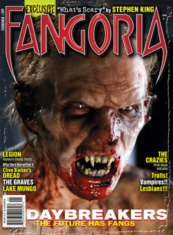
The masthead, ‘FANGORIA’ is red and bevelled with a white outline. The ‘F’ and ‘A’ are pointy at their bottoms, resembling vampire teeth. There is a photograph of a creature with human features and structure. It has rotting teeth, fangs and blood dripping from its chin. The strapline, ‘EXCLUSIVE ‘‘What’s Scary’’ by Stephen King’, is situated above the masthead in yellow and pale blue. The issue number is in white, on the left of the magazine, between the edge of the page and the masthead. The barcode is in the bottom left hand corner of the page. There are six coverlines on the left, near the bottom. Three are in yellow ochre and one in white. These are in capitals in the same font and style. One is white and of a smaller size, a different font and underlined. Above that is a smaller coverline in olive green in the same font. There are five coverlines on the right side of the cover. Three of these are in yellow ochre and one is in white. Of these, one is in capitals and the other two are not. These are all of the same size and font. There is a much smaller coverline in olive green in a different font. There is a large coverline at the bottom of the cover, most likely referring to the photograph.
Masthead
The masthead, ‘FANGORIA’ is red and bevelled with a white outline. The ‘F’ and ‘A’are pointy at their bottoms, resembling vampire teeth. ‘FAN’ most likely refers to the magazine being aimed particularly at fans of horror which feature gore, e.g. slasher, while ‘GORIA’ refers to the gory aspect of some subgenres of horror, which the magazine presumably specialize in. This is further emphasized by the bloody, ruined appearance of the character on the magazine cover, e.g. blood dripping from its chin, fangs used to attack victims, damaged ears, grubby and unkempt appearance, etc. The use of the colour red for the masthead and the many sharp edges and points the font features connotes the typical ideas of danger and fear within horror.
Camera shot style
The photograph is a facial shot. The neck and beginning of the shoulders can be seen also.
Character(s)
One character features on the cover photograph of what is presumably meant to be a zombie, or a zombie-like creature. Its skin seems rubber-like with lots of angry, unnatural wrinkles. Its skin is white, but again, the shade is unnatural. Its teeth are rotting, chipped and decayed. The two fangs bared are prominent, connoting fear of attack and coming across as intimidating to the viewer. The blood dripping from its chin suggests that it devours creatures of some sort, although what that is specifically is unspecified. It also has bloody, pointy ears that look damaged, suggesting past violent encounters and fights.
Composition/NVC
The character looks angry and comes across as very aggressive, baring its teeth with an angry facial expression. This connotes danger and is readily poised to attack, which is almost certain since it has attacked before. This is shown by the blood and unkempt appearance, suggesting it has already
been involved in past attacks on victims.
Costume/Make-Up
No clothes are visible. Presumably the creature is fictional and doesn’t actually exist, so extensive make-up and prosthetics were most likely used on a model, e.g. fake blood, fake teeth and fangs, a wig, contacts with a colour that doesn’t naturally occur, etc. Creative use of make-up can be used to create specific desired effects. In this case it creates a dramatically horrific look.
Target Audience
The magazine’s target audience is most likely 18+, specifically horror fanatics and fans of gore and fantasy. Its appeal to this audience is demonstrated through the cover photograph’s explicit graphic nature and use of a blatantly fictional character, text and font and bold colour scheme. They most
likely like to keep up with the latest films of this subgenre and are very much interested in the alternative rather than the mainstream. They may also be
interested in other sections of the entertainment industry, e.g. music, art, etc., and be creative.
