[Q.1] In What Way Does Your Media Product Use, Develop or Challenge Forms & Conventions of Real Media Products?
Definition of convention: The term convention means a way in which something is usually done. Media products such as horror magazines normally include barcode, main image, coverlines, selling-line etc. This question wants us to explain the different conventions that were used in the three media products poster magazine and trailer.
There are many different types of convention that can be applied to all types of media products such as posters, trailers and magazines. The genre our media products was focused on is horror, over the holidays we did research on the different sub genre of horror such as j horror, psychological, supernatural etc. The sub-genre that was chosen is 'slasher'.Conventions are used to attract different types of audiences to the product, this can be done by making it look professional and unique. we didn't just want to use the current convention to our media products, but try to develop and challenge it as well in order to differentiate our products from competitors.
To get a good idea on what type of conventions horror products follow, we all did textural analysis (found in development) on trailer, magazine and poster. this helped us know the different types of conventions used in horror products and how we could incorporate theses ideas into our own work too. The sort of things we looked at was the types of shots used in the trailer the layout of the poster or magazine , types of font used and colour scheme.
With the information that i have gathered about trailers, magazines and poster; the trailer shouldn't be reveled too much in order to not give too much away about the movie also, a really convincing trailer has to be made to attract consumers.


Through YouTube we are able to distribute our trailer to the public so that they can view it too. a lot of companies, not just film makes use YouTube that is able to broadcast to a multiple of people not just in London, but around the world. therefore by using YouTube to advertise our horror trailer, we are following conventions of what existing film companies do.

When film companies release films, they usually follow conventions of using a website. Film companies usually have a website which would include the details on their media products. We used a website named "weebly" due to the fact that it is free of charge. This was effective to us as we are a production group with limited sufficient funds. 'weebly' was able to meet our needs financially and was also able to meet our needs of following conventions of using a website like existing film companies do.

We wanted to make sure media convention was followed in order to make an effective teaser trailer. We incorporated existing horror trailer ideas into our own trailer so that we also had a structured trailer.We tried to develop and challenge media horror convention so that our product will look different and not just the same as everyone else, so that the audience will look forward to seeing our trailer. This was achieved by us changing the sequence of horror convention when making our trailer so that it won't be too parallel to existing ones . As a group we thought it will be more intriguing to make our product have, non-leaner shots, dramatic tension; instead of the typical.
|
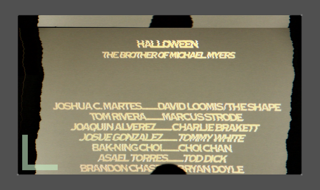
Film title: Hush
Year of release: 2013 Director: Belkis, Abi , Sarah and Kayne Production: Graveyard Studios Principle Cast: Bony, Tanaka, Lind,Stephanie and Cameron Synopsis Johnny a seemingly mute boy who lives with his mother and sister. With the constant memory of torture by his father at childhood, Johnny cuts himself from the world. He frequently gets bullied by nasty,vicious group of popular students at college untill one day he loses his cool, his range transforms him into an untouchable serial killer around the college. What lengths will Johnny go to stop the bullying ? At what cost to everyone including his friends? |

We incorporate Todorov's theory into our trailer because we felt that in all horror movies any theory can be applied. There are three aspects of his theory; equilibrium, disequilibrium and resolution.
Narrative Theory (Todorov theory applied)
|
Camera Angles

|
Establish shot
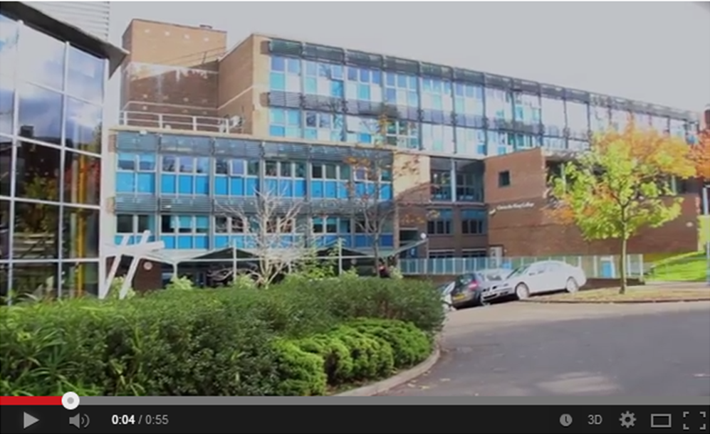
Establishing shot is a convention used by other film editors, its important as it shows the location of where the film is going to be located this is iconic to other horror trailers as well such as the movie insidious, Even though its quite similar its still different in a way. 
|
|
|
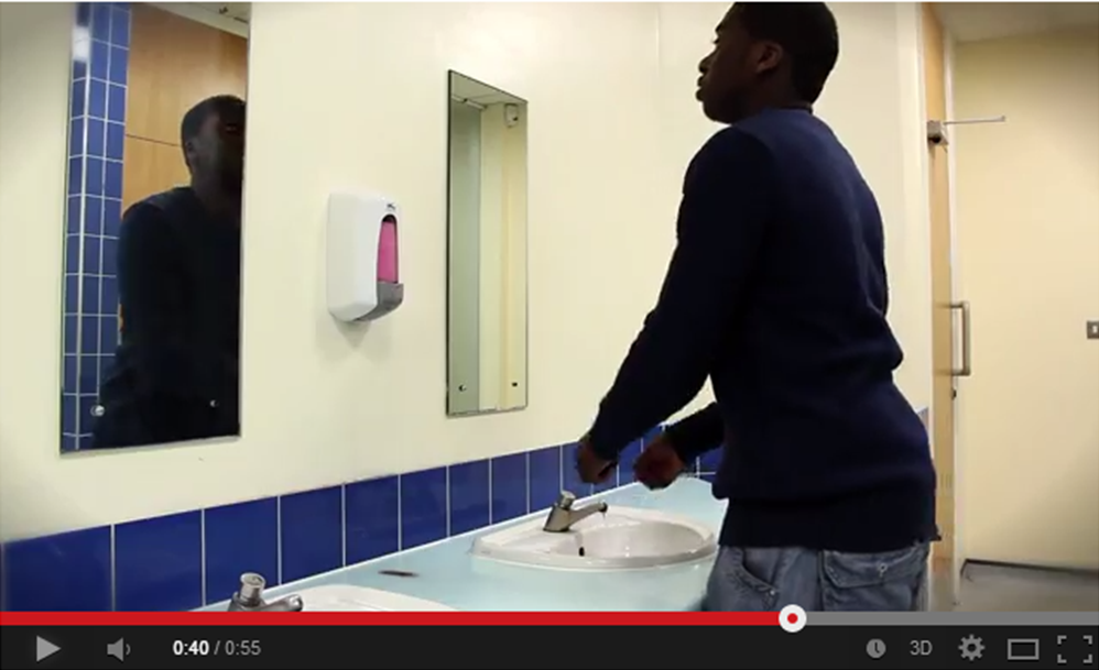
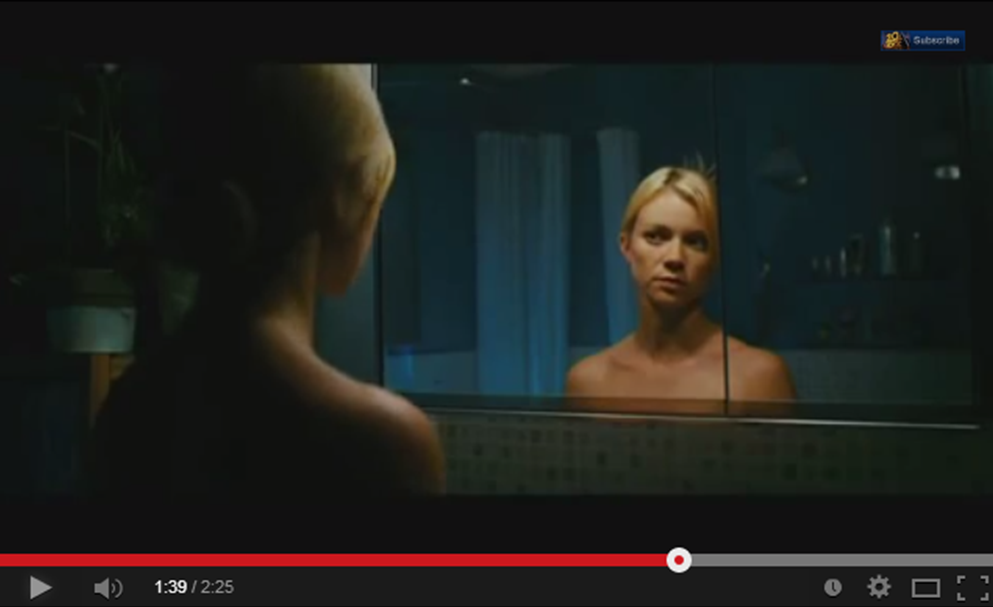
Bathroom shot
This Bathroom shot in our trailer was inspired by the movie Mirror, as you can see the shots are quite different in a way. |
|
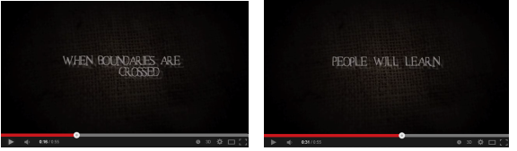
Its evident that we followed convention by making the trailer 'teaser' so that too much information is not reveled to the audience , which is common among any sort of trailer. The whole point of a teaser trailer is to drive someone to want to watch the actual movie therefore teaser trailer last for not more than one minute long. . Before conducting the trailer we looked at several horror trailer to give us inspiration, so we could have a clear direction. However it can be argued that we challenged the length of the trailer. this is because many existing horror trailer sometimes last for more than one minute long.With our trailer we thought that it would be better to make it less than one minute long.
|
We looked at this trailer in particular as the concept of the movie 'Carrie' is very similar so it would be a good idea to incorporate some elements of' 'Carrie' into the trailer. The pacing with Carrie starts off slow then towards the middle fast then after slow; its set in a non-leaner pace. which is good as it makes the trailer look interesting . With our trailer it starts off with a slow pace till the middle where you hear a fast montage pacing. we made sure the shots were non -linear , to make it more captivating for the audiences.
|
|
|
|
Transitions
We used a fade at the end of the trailer when the antagonist drags one of the victims away. There was also fades that led to a pitch black background in other parts of the trailer.Film editors tends to use fades as well, which is a convention we followed. |
|

|
|
Flickering Light
we was inspired by the movie 'collection' with the flickering light scene we used in the bathhroon 1.52 seconds light scene 'Collection'
Montage
Towards the middle of the trailer we used fast cuts which is a series of different shots that last for not more than 4 seconds long on the screen. Fast shots are used as it tends to keep the audience engaged with the trailer and because there is so many different shots the audience is less likely to find it boring. we got our inspiration from scream 4 trailer Bad TV
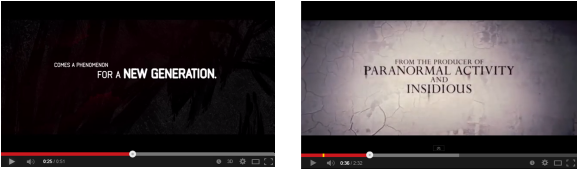
We wanted to follow the bad tv effect convention which was used in REC and paranormal activity. This effect was used to build up tension within the trailer. We used it at the start of the trailer and classroom scene. 
Paranormal Activity

|
G.Y.S
REC
|
|
Mise en scene plays a big part in any sort or trailer however in this case horror.
lighting is really important within any horror movie, in most cases darkness is associated with horror as it tends to scare the audiences.Some shots are shot in the dark so that the viewer can feel a sense of anxiety. whereas , shots with high key lighting makes the audience feel less scared .When producing our horror trailer we felt it would good to use a mixture of both low and high key lighting , to make it look interesting. in addition slasher movies tend to be dark, because your able to create shadows in order t give a mysterious feeling.

Costume is one of the most important factor as it defines who the characters are . to some extent it can it can make the audience understand the characters better, just by how they are dressed. within our trailer the characters are dressed casual this is good as the audiences are able to relate to them easily (mainly teenagers) and also to portray the typical stereotypes of teenagers hence why its set in a college. furthermore, costume helps the audience distinguish who the antagonist is.One main reason why the antagonist was dressed in black is because, black is a colour associated with death and evil.
|

These are the different types of weapons that we could use in the trailer. As you can see above the most iconic weapon used in slasher films are sharp objects, so we also wanted to follow this convention by making the antagonist use a knife.

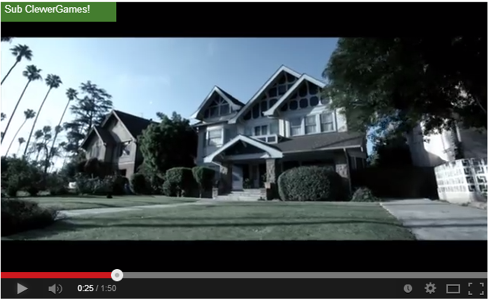
With slasher films there are two types of environment which are normally used it either a setting that the characters are familiar with or one they ant which is a deserted area .A common setting used in recent slasher films is a 'college'. We followed slasher convention by locating our movie in a college as well due to the fact that.
|


Captions
We wanted to show continuity with the poster magazine and trailer so we incorporated the antagonist sack face as a background for the captions this is a convention that we developed as many existing trailers, caption background have little meaning to their film. |


Final cut pro is one of the main software we used to edit the trailer, and this allowed us to develop, challenge or follow certain types of convention we was a able to use transition effects such as fades which is a convention we followed because most horror movies use it. We also used it to edit the captions as well. Overall I would say that Final Cut Pro is good as you're able to use different techniques to edit your video.
|


|
An important element within horror convention is Sound. We looked at a mixture of sounds that are used in real existing trailer and Incorporated it into our own trailer. for example when we looked at the Sinistar , Carrie, mama and scream we found out that both non-diegetic and diegetic sound was used in each trailer.
Non-diegetic sound is sound that the characters can't hear, but the audience is able to hear it. With in our trailer we mostly used non diegetic sound as we didn't want to much dialogue in the trailer. Non-diegetic sound is a convention we followed from other horror films. Diegetic is sound that both the audience and characters can hear an example of this is dialogue. We used dialogue within our trailer and this supports of horror trailer. Sound track pro enabled us to to edit the sound and make transitions to it such as fades and blending the sound together so that it flows and sounds professional. In the trailer non diegetic sounds starts off at the very beginning. while the non digetic sound is playing we used dialogue which overlaps the non-diegetic sound which is of people laughing, we then after continued to use dialogue with non diegetic sound still playing. When Sam punches Johnny, fast montage sound starts to kick off and only non-diegetic sound is used.
|
|
|
|
|

photoshop was our main software we used to edit the poster and magazines. with photoshop your able to use a wide range of effects to make it more appealing to the audience and also to make our product look different. in our poster the main image is red this was achieved by changing the colour balance of the picture, we also used photoshop to added the photo strip tape at the bottom magazine.

Effects Using PSCS6

|
Before making our poster we looked at existing ones first. We didn't just want to follow they typical horror convention but try to develop it as well. To the right there are different poster that we was inspired by.
We belie that our poster fits the convention, like other horror poster. In this section we have broken the convention up and compared it to real existing ones. As well as following we tried to develop and challenge the conventions. 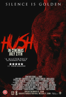
Film title: Hush
Year of release: 2013 Director: Belkis, Abi , Sarah and Kayne Production: Graveyard Studios Principle Cast: Bony, Tanaka, Lind,Stephanie and Cameron 
Poster/colour scheme
For our horror poster it's obvious that we followed horror convention by using colours such as black and red which is associated with horror. We made the main image red and the background black. By us making the main image red was a sign to show the audience that our sub genre is horror 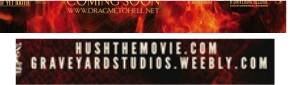
Website
The website link is located at the bottom of the poster.the main reason why companies add a website link is to Increase more awareness about the release of the film so that the reader is a able to know as much information as possible. Film companies also feature other items on the website such as online games, clothes and many more. This will then allow their revenue to increase. 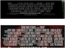
Credits
This is placed at the bottom of many horror poster. this was a convention that we followed as well , as it tells the reader who produced, distributed and the cast who stared in the movie etc, so that everyone Is given full credit on their role. Above shoes a credits that's normally in real magazine. As you can see it looks similar to our poster, and this is a convention we followed. 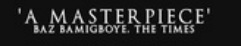
Pull quote
In our poster we used a pull quote to show the audience why they should watch our film.This is normally shown on a few existing posters By using phrases such as "A Masterpiece" will attract the audience. Not many existing horror poster use a pull quote. |
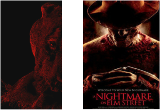
Main image
The main image is important because to some extent it determines weather or not the audience will want to watch the movie. Normally the protagonist or antagonist is featured on the main poster we therefore followed existing poster convention by displaying the antagonist on the front cover as it will attract the audiences. 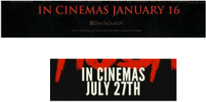
Release date
This is the the date and year the film will be in released in cinemas by. As well as that it's important for the production team to pick the right time to release the film, so that the audience will want to watch your film instead of others.We followed horror convention by adding a release date, just like how the "Devils Due" did too, which is shown above. 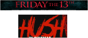
Title
A vital convention that we followed was adding a title to the poster. The title tends to be small and easy to read so that the audience are able to remember it. In a way the film title is stigmatized to the film. 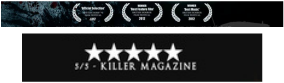
Festival award
Festival award convention is also shown on a few poster. However it's a good way of promoting the film for example rating the film '5/5' will Influence the audience into watching the movie. 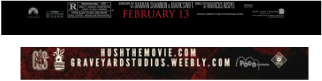
Logo
Logo is an important element within a poster as it tends to show the audience the company that produced the film. The logo is normally positioned at the bottom of the poster to bring less attention to it so that the audience can focus on other items. This was a convention that we followed. 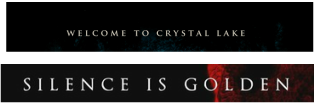
This is the tagline it can be placed anywhere on the poster,but most real magazine position it on the top of the poster which is a convention we followed. Our Tagline says "silence is golden" this is a short description of the teaser trailer. The Tagline contrast well with the Friday the 13th.
|
With our magazines we used a similar process as we done for the poster which was looking at existing magazines and incorporating some ideas in ours, this helped us gain understanding of key conventions that will be essential when producing our magazine.We identified key convention that we thought we could develop as well.
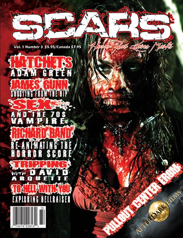
The main image is big and effective i like the fact that they used colours such as red and white because you can automatically tell its a horror magazine
|

i like how they put pictures on the left and right side of the magazine it makes it more visual this follows the convention of other horror magazine as they tend to use more than one image on the front cover
|

followed convention of using a main image, the fact that the antagonist is covering his face make the audience feel a sense of mystery.
|
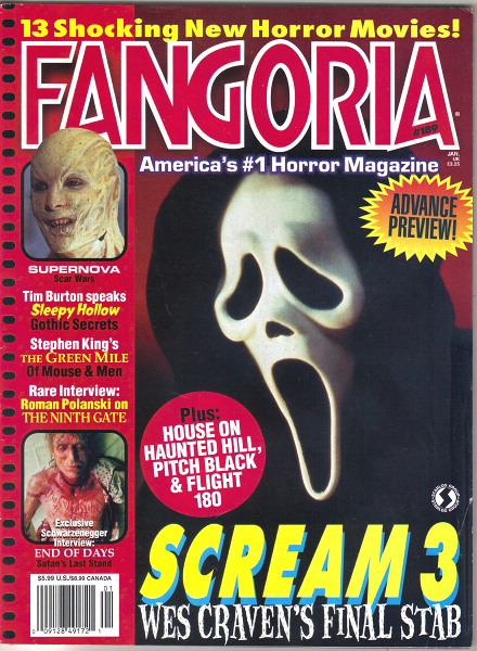
This follows convention such as masthead, barcode, coverlines etc. The main coverline is 'scream', the colour yellow makes it stand out a lot
|


Magazine name: Killer
Production company: Graveyard studios Directors: Belkis, Abi, Sarah and Kayne 
Left third/Coverlines
Left third is an important element seeing as in shops you can only see the left side of The magazine so it's important to make it eye catching so that the magazine can grab the audience attention. In our magazine the cover lines run down the left side of the magazine Converlines are small information telling the reader what sort of things they will find in the magazine. Coverlines should be interesting so to an extent that the audience will want to buy the magazine 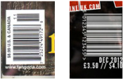
Barcode/price
This is a convention that we followed As well the barcode is what the shopkeeper uses to scan the magazine. Price is also a important factor because you have to set the price according to the type of audiences you want to attract. Above is a real existing barcode, we followed this convention because its essential in all types of magazines. However some times the barcode is placed at the back of the magazine rather than the front, but we wanted to place it at the front so it could be similar to other horror magazines. |

Selling line
This is normally located at the top of the magazine it's short, snappy and not to long so that the reader is able to read it quickly. This is found in most magazine and its a convention we followed.Above is the selling line that most real magazine use . Its a short sentence to try and sell the magazine to the audience 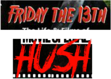
Main coverline
This normally has reference to the main image We used the colour red so that it could stand out also because red is associated with horror. the type of font used was the same font we used for the poster because of the fact that we wanted to show continuity through out our 3 media products so that the audience is able to recognize it. The main coverline is the largest text on the magazine This is a convention we followed. the main coverline is a convention that many magazines have. 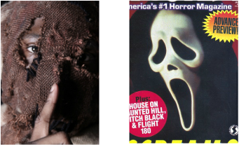
Main image
Main image is big and takes up the whole page. The subject is important because if the picture doesn't look interesting the audience may draw away from the magazine so its important that the main image is effective, this is why we used a picture of our antagonist due to it be scary.We used a close up image so that your able to see the subjects non-verbal communication. However in this case you can't because the actors wearing a mask which makes it look mysterious. 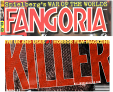
Masthead
A masthead is positioned on the top of the magazine. It's normally big and an bold so that it stands out from the rest of the magazine, it's also done in a specific font so that the audience is aware of what type of magazine it is. We developed our masthead by not putting it in a straight line, like the typical type but making it go diagonal we did this because we wanted our magazine to stand out from the rest.We followed the convention found in all horror magazine. Above shows a real magazine that inspired us with our masthead. |
HighLighted Convention of Slasher
|
|
|
Theme:
The stereotypes of a slasher film is that the killer is a ordinary person who has suffered some kind of trauma or abuse in there life. So to get revenge he kills his victims one by one.
location:
The location is sometimes apart of the killers identity because it could explain a significant event which the killer took part in
Antagonist:
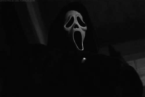
The killer normally has a mask on which covers their identity and the only time the killers face is revealed is at the very last scene. it tends to be a male not female
Weapon:
In Slasher films most of the time the killer uses a weapon such as knife, chainsaw, axe, machete, spears, saws and many more. Its basically anything that slashes and also sharp objects.
Final girl:
In slasher films there's always a final girl; the one that defeats the killer and left to tell the story. It has been observed in many films including: scream, Halloween and nightmare on elm street
The final girl is typically virginal and generally refuses to take part in any illegal or sexual activity. They normally have a unisex name for example, Billie and occasionally has shared history with the killer.
The stereotypes of a slasher film is that the killer is a ordinary person who has suffered some kind of trauma or abuse in there life. So to get revenge he kills his victims one by one.
location:
The location is sometimes apart of the killers identity because it could explain a significant event which the killer took part in
Antagonist:
The killer normally has a mask on which covers their identity and the only time the killers face is revealed is at the very last scene. it tends to be a male not female
Weapon:
In Slasher films most of the time the killer uses a weapon such as knife, chainsaw, axe, machete, spears, saws and many more. Its basically anything that slashes and also sharp objects.
Final girl:
In slasher films there's always a final girl; the one that defeats the killer and left to tell the story. It has been observed in many films including: scream, Halloween and nightmare on elm street
The final girl is typically virginal and generally refuses to take part in any illegal or sexual activity. They normally have a unisex name for example, Billie and occasionally has shared history with the killer.

Location
|

Protagonist
|

Weapon: Knife
|
Antagonist
|
|
Overall I can argue that we followed convention for our poster magazine and trailer.
For the poster, we believe that we met the codes and convention ,we made sure we Incorporated real horror poster convention so that we followed convention as well develop and challenge. For example we followed the convention of placing a main image in the center of the page. Trailer: overall we followed the convention of horror films by trying to copy the sort of effects they used for example bad T.V effect ; this is a convention we followed . Lastly, with the magazine we conformed to the codes and convention as we followed the conventin 0f having a masthead which was placed at the top of the page and other convebtion too. We belive that we followed, developed and challenged the horror convention for our three media produts. |
VideoThis is an interview of me comparing my poster and magazine to existing one. i did this because i wanted to see if we followed convention and if the poster and magazine looked professional.
|
