
First I looked at some real media texts to get some ideas of the sort of layout, colour scheme, text and image(s) I would use for the final draft of the magazine cover. I chose these because of some of the elements that caught my eye, e.g. fonts, unusual layout, alignment of text, photograph subject matter and colour schemes. The aspects I like the most will be incorporated into the drafts and draft images used for the development of the magazine front cover and may even make it into the final draft!


Drawn Drafts
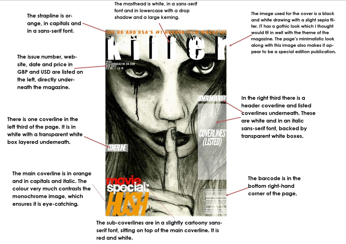
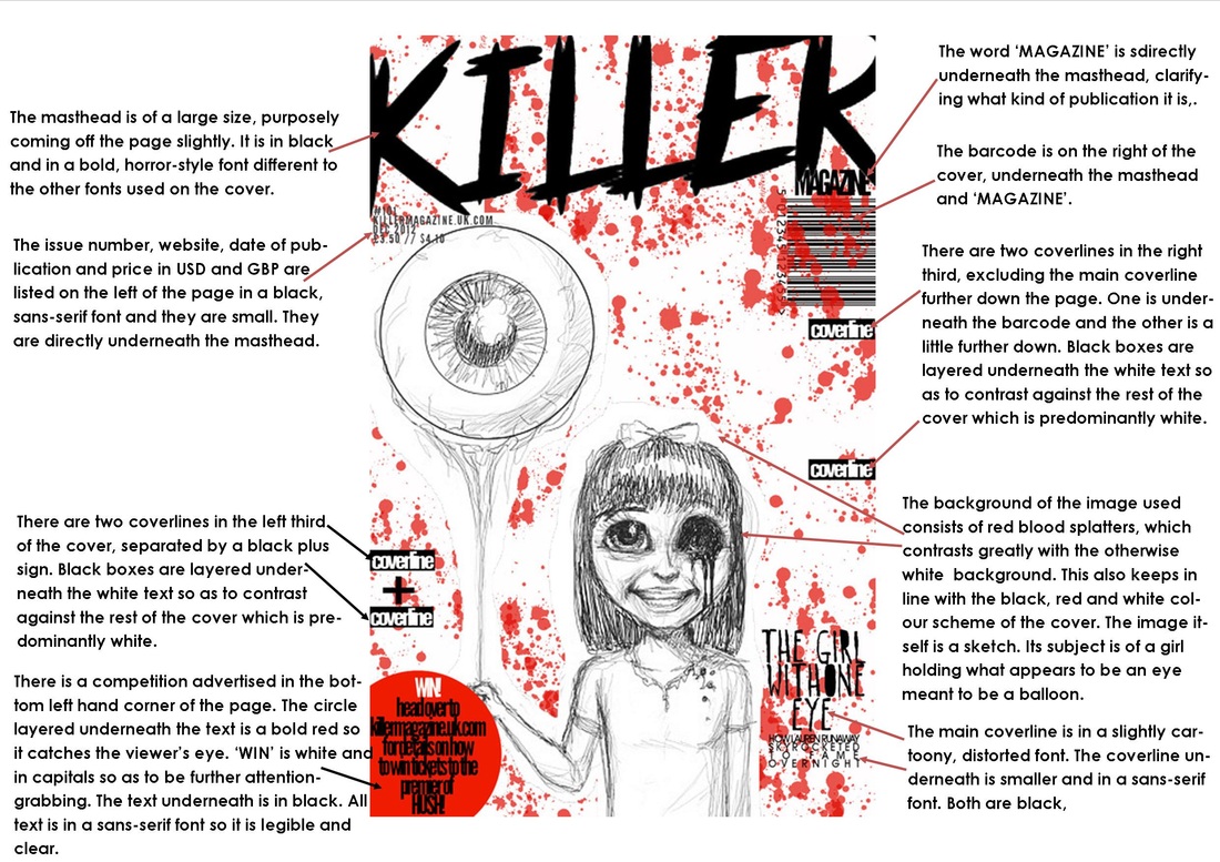
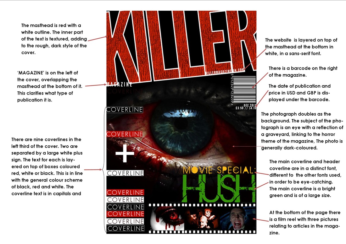
After looking at these real media texts, I took elements of their layout that I liked and incorporated them into my own layout drafts, as shown below.


Adding Visuals
Based on these layout drafts, I constructed drawn drafts with visuals.


Further Development
I created drafts using Paint Shop Pro X2 that further build on the drawn drafts.

Practise Shots and Composition
I also took some practise photographs. I used a range of shots which convey different moods. The low-key lighting used is typical of horror and conveys mystery, fear and danger. The subject holds a sharp weapon, in this case a knife, which is essential for any slasher film. They are male and they wear a mask concealing his identity but being iconic at the same time as it is so distinctive and unusual. Aside from this, he wears very casual clothes. These link back to the main location of the film which is set in a college.
Film Poster: Step-by-Step
Below is the creation step-by-step of the film poster.

First I looked at some real media texts to get some ideas of the sort of layout, colour scheme, text and image(s) I would use for the final draft of the film poster.

A Nightmare on Elm Street (1978)
What I like about this poster:
What I like about this poster:
- The vintage filtering relating to the year that the film came out in. It gives the poster a unique look
- The strapline immediately brings the viewer in, mentioning the victim's name, 'Nancy'. As a result the viewer may be more likely to go and see the film

The Texas Chainsaw Massacre
What I like about this poster:
What I like about this poster:
- The strapline seems slightly more prominent than the title itself, bringing the viewer into the story more and encouraging them to go and see the film. It is of a very large size and in a simple, bold sans serif font
- The title naturally needs to stand out and is an important part of the poster so this is coloured in red

- Hallowe'en (1974)
What I like about this poster: - Layout is clear and simple
- Text contrasts heavily against the black background and is in a bold, chunky sanserif font so it is easy to read
- A simple yet unusual image of a pumpkin poised with a knife is iconic of the film and gives the viewer a tiny taster of what it is about, drawing them in
- The strapline is aligned and positioned in an unconventional way but yet doesn't look out of place on the page. Its capitalization and use of few words could also make it rememberable and seem like a sort of secondary title

Kick-Ass 2
What I like about this poster:
What I like about this poster:
- The image is so flamboyant there almost is no need for a strapline - the image goes hand in hand with the title and speaks for itself
- The casts' names are slanted and in oblique, connoting fierce action, movement and spontaneity like the image
After looking at these real media texts, I took elements of their layout that I liked and incorporated them into my own layout drafts, as shown below.
Based on these layout drafts, I constructed four drawn drafts with visuals.
I created drafts using Paint Shop Pro X2 that further build on the drawn drafts.
Practise Shots and Composition
I also took some practise photographs. I used a range of shots which convey different moods. The low-key lighting used is typical of horror and conveys mystery, fear and danger. The subject holds a sharp weapon, in this case a knife, which is essential for any slasher film. They are male and they wear a mask concealing his identity but being iconic at the same time as it is so distinctive and unusual. Aside from this, he wears very casual clothes. These link back to the main location of the film which is set in a college.
