
SAW III(KAYNE)
Film Title: Saw III
Year of Release: 2006
Director: Darren Lynn Bousman
Production: Twisted Pictures
Principal Cast: Tobin Bell, Shawnee Smith, Leigh Wannell, Costas Mandylor, Dina Meyer
Films Origin/Info: This is the sequel to Saw II and prequel to Saw IV
Synopsis: Jigsaw kidnaps a doctor to keep him alive while he watches his new apprentice put an unlucky citizen through a brutal test.
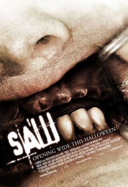
Conventions: The poster for Saw III follows most conventions of a horror movie poster due to the graphic nature of it. It gives a sense of torture which connotes to the type of film Saw III is. The poster also goes against some conventions of horror posters due to the fact that the lighting within the poster is very high key excluding the inside of the of the persons mouth.
Denotation: The poster features a close up on an unknown persons mouth, the mouth has missing teeth on the top half of his gums this suggests he has had his teeth forcefully removed from his mouth which is a well known torture method. The three bottom teeth are used to stylize the III within “Saw III”. This goes well with the film as the main theme of the saw movies is torture. The poster also says “Opening wide this Halloween” which relates back to the forceful removing of the person in the pictures teeth as dentists usually say “Open Wide” when telling someone to open there mouth.
Colour: There aren’t many colours used in this movie poster and the ones that are in the poster are very dull such as the red in the person in the pictures gums which adds to the horror effect they are trying to pull off. It's also very high key when it comes to the face of the unknown person which is not very common within horror posters. It's very common in horror posters to be very dark and dreary
Font/Names: The type of font used is a customized sans serif font. The font is used in all of the Saw movies it’s a very effective font as it’s very rugged and rough which add to the effect the poster is trying to give.
Year of Release: 2006
Director: Darren Lynn Bousman
Production: Twisted Pictures
Principal Cast: Tobin Bell, Shawnee Smith, Leigh Wannell, Costas Mandylor, Dina Meyer
Films Origin/Info: This is the sequel to Saw II and prequel to Saw IV
Synopsis: Jigsaw kidnaps a doctor to keep him alive while he watches his new apprentice put an unlucky citizen through a brutal test.
Conventions: The poster for Saw III follows most conventions of a horror movie poster due to the graphic nature of it. It gives a sense of torture which connotes to the type of film Saw III is. The poster also goes against some conventions of horror posters due to the fact that the lighting within the poster is very high key excluding the inside of the of the persons mouth.
Denotation: The poster features a close up on an unknown persons mouth, the mouth has missing teeth on the top half of his gums this suggests he has had his teeth forcefully removed from his mouth which is a well known torture method. The three bottom teeth are used to stylize the III within “Saw III”. This goes well with the film as the main theme of the saw movies is torture. The poster also says “Opening wide this Halloween” which relates back to the forceful removing of the person in the pictures teeth as dentists usually say “Open Wide” when telling someone to open there mouth.
Colour: There aren’t many colours used in this movie poster and the ones that are in the poster are very dull such as the red in the person in the pictures gums which adds to the horror effect they are trying to pull off. It's also very high key when it comes to the face of the unknown person which is not very common within horror posters. It's very common in horror posters to be very dark and dreary
Font/Names: The type of font used is a customized sans serif font. The font is used in all of the Saw movies it’s a very effective font as it’s very rugged and rough which add to the effect the poster is trying to give.
JENNIFER'S BODY(BELKIS)

Title: Jenifer body
Year release: 2009
Director: Karyn Kusama
Production/financing Company:
Principle cast:
Megan Fox
Amanda Seyfried
Johnny Simmons
Adam Brody
Synopsis: Jennifer’s body is a dark comedy film. The film stars Megan fox, Amanda Seyfried, Johnny Simmons, and Adam Brody. Fox portrays a newly-possessed cheerleader who kills her male classmates, with her best friend striving to stop her.
Denotation: There is a girl sitting on a table which doesnt look like it from the morden era, from the table you can see a human hand sticking out. The image if the girl is a long shot and the coustume shes wearing is rather skimpy and shes holding some books. Behind her on the board we see some writing in chalk saying 'HELL YES'
Lighting: There’s a mixture of high and low lighting used in the poster. In the middle of the poster there is a use of high key lighting this then gradually changes and moves into a more low key use of lighting. The high keyed lighting may connote that the actress (Meagan fox) is the main character of this horror movie. As well as that, it could also mean that the character has two sides to her. (Light and dark)
Main image: A long shot image was used to show the actress from head to toe and also, what’s behind her as well. The character non-verbal communication seems very seduces and confident this could portray that she’s a flirtatious character hence, the fact that she’s wearing a red sleeveless top and a chequered mini skirt. This supports the male gaze theory by Mulvey, however in this poster it looks as if she is using her body as a tool to seduce ‘boys’. The colour of the sleeveless top is red this could represent sexual impulses and danger. The actress is sitting on top of a desk with a mysterious hand sticking out of it and bending backwards slightly whilst holding a school book, with her legs crossed over could connote that she’s just not an ordinary school girl.
Font/Names: The font used in this poster are all san serif which imply the film is made from the morden era although the props used in the images says otherwise.
Setting: In a classroom.
Mood: Jennifer’s body creates a mood that’s unpredictable due to the fact that the main image is of a school girl that’s holding books in her hands, so you wouldn't automatically think it’s a horror film straight away, but because the lighting is quit dull you kind os suspect that there's more to this movie.
Convention: Although it’s an horror film the poster does not make any relation to a normal horror film poster for example in
a normal horror film poster weapons are normally used or scary characters however in this poster the main charters just looks ordinary.However there is some aspects that make it seem like an horror film for example, the colours used are mainly black and red which is iconic to other horror posters. The fact that “Jennifer body” is highlight in red, could be a representation of blood.
Tagline: “she’s evil… and not just high school evil” makes the audience contemplate weather she has two personalities to her, also the fact that the character of Jennifer is evil already creates a phenomenon and makes the audience contemplate to what extent her evil side drives her into series of malicious events.
Credits: The credits have in his poster as followed past poster convection and is located at the bottom of the page including all the production/ financial company.
Colour: The colour of the magazine is quite dull apart fro the main images clothing which is bright red .
DRAG ME TO HELL (ABI)

Film Title: Drag Me to Hell
Year of Release: 2009
Director: Sam Raimi
Production/Financing Company: Universal Pictures, Ghost House Pictures, Buckaroo Entertainment
Principal Cast: Alison Lohman, Justin Long, Ruth Livier
Films Origin/Info: This movie is somewhat of an adaption to Casting the Runes
Synopsis: American-born Loan Officer, Christine Brown, is stalked and assaulted by Mrs Ganush after she assertively
refuses to extend a loan. Younger and more agile, she fights off the older woman, but her coat button is removed during this scuffle, and a curse is placed
on her. When she starts to hallucinate; confides in boyfriend, Clay - a Professional Psychologist - both consult a Psychic, Rham Jas. The aftermath of this consultation will make her aware of the malevolent force she is up against, as well as the steps she has to undertake to protect her.
Denotation: The movie poster consists of a female with her mouth opened as if she is screaming also; there are three different hands in the picture dragging her in a downward manner also these hand do not look very much like human hands do. There are houses in the background of the main image, which is under a gloomy looking sky. There is also fire around the main character image
Settings: Outside someones house
Conventions: The poster for Drag me to hell has followed similar convention of a supernatural film. This is because in supernatural movie there is not a lot of colour used. The colour used is mostly black and white which is located behind the image of the female. It represents that the film may have something to do with olden days. In addition, most films of this genre seem to have some sort of hand somewhere near the victim. Some examples are The possession and The apparition. The inhuman (supernatural being) hand in this case is pulling her down towards the fire which connotes danger and devil presenting some dangerous element for the audiences as well as working with the title drag me to hell.
Mood: The mood set by poster is seemingly disturbing as it conveys anxiety. This is because the female in the main image looks like she’s in pain and it may leave the audience worrying about what type of pain she’s in or what did she do to be in that position
Font/Names: The type of font used in the poster is San serif fonts on both the title and tagline this connotes a more modern feel, which engages the audience and wants them to watch the film even though they may think the film is about the olden days they would realise there is a Morden twist to it
Credits: In the credits on the teaser poster, we can see that it says coming soon this means it came out before the film did. This helps to increase the films fan base as it will get people interested in watching the film if they saw this way before it came out.
Colour: The colours used in this film are not too harsh. It helps to emphasise that the film is very much a supernatural film but with the less gory details, the brightest colour on the page is a low red in the fire and that hardly signifies gore as much as a slasher film would do. Also the title of the movie is white
that also portrays supernatural as most audience can relate that to their knowledge of ghosts which are usually white
Tagline: The tagline for this movie is “Christine Brown has a good job, a great boyfriend, and a bright future. But in three days, she's going to hell” This works very well with the poster because it catches the audiences attention straight away. It is allowing the audience to know a bit about the female on the poster but leaving them to question why she is going to help, hence makes them want to watch the film.
NVC: The nvc of the main image looks like shes screaming in pain which is effective with the use of fie that surrounds her. She also isn't looking directly at the audience this normally isn't a good thing but as it doesn't really engage with the audience. However her looking away is very effective as i believe if she was looking at the audience the image will not be as strong as it it now because it looks like shes too caught up in the pain shes feeling.
MY BLOODY VALENTINE (SARAH)

Year of Release: 2009
Director: Patrick Lussier
Production: Jack L. Murray
Principal Cast:
Films Origin/Info: a remake of the 1981 Canadian slasher film of the same name
Synopsis:
Denotation
The title of the film is in blood red in capitals. '3D' is in the same style but of a larger size and in white. Underneath '3D' is the tagline, 'GET YOUR HEART BROKEN' in a serif font and of a much smaller size and
with a fairly large kerning. Underneath this are film credits, and below that the release date, which is in red, contrasting the white text and dark background. There is an image of a group of three unidentifiable individuals wearing gas masks and boiler suits, holding long, sharp weapons similar to icepickers. There is a hot white spotlight behind the group and a red spotlight to the right of the image.
Title
‘MY BLOODY VALENTINE’ is in bright red, in capitals and is of a fairly small size in relation to the rest of the page. Directly underneath this, '3D' is displayed in white, which contrasts the predominantly dark background. It is slightly larger than the text above, most likely so it can grab the audience's attention. The '3D' element of the film may well appeal because it is a relatively new technology in film that people would want to experience. The ‘MY BLOODY VALENTINE’ part of the title is situated near the bottom of the page, with ‘3D’ directly underneath. The tagline, film credits and release date are underneath the title.
Characters
The identities of the only characters portrayed in the poster are not made clear as they are wearing gas masks which fully cover their faces and fully-covering boiler suits. Three of these identically dressed characters are shown, with one at the front being the most prominent and wielding a long, sharp weapon similar to an icepicker. The concealing of their identities creates an element of mystery and danger as what is approaching isn’t entirely recognizable. However, their costume does make them distinctive.
Costume/Props
The characters shown on the poster are wearing gas masks which fully cover their faces and fully-covering boiler suits. The one at the front being the most prominent is holding a long, sharp weapon similar to an icepicker. Their clothing is very dull in colour, a khaki-grey mix.
Non-Verbal Communication
The villains approach in a group, creating an intimidating feel and adding to the element of fear central to the film. They hold their weapons, poised to attack. Paired with their seemingly non-existent identities and lack of facial expressions and anything else that could indicate character, this would certainly put fear in anyone!
Lighting
The lighting is low-key overall, with a predominantly black background. The white spotlight (to the left) and the red spotlight (to the right) serve to highlight the fast-approaching villains. The bold red spotlight in particular signals fear and danger in an explicit manner.
Text
‘MY BLOODY VALENTINE’ is in capitals and in blood red, similar to the red spotlight. The font is of a rough style and reminiscent of war, turmoil and
violence, which is also what the stark colour choice conveys. It is of a medium size, but a lot smaller in relation to the rest of the poster. ‘3D’ is situated directly below this and is of a slightly larger size and in white, in the same font. ‘3D’ being highlighted in this way would be most likely because this has widespread appeal to the audience due to the fact that it enhances the viewer’s experience because of the inclusive, realistic element of viewing it creates in-cinema.
‘GET YOUR HEART BROKEN’ is the film’s tagline and is of a smaller size, situated under ‘3D’ and also in white. Use of the word ‘YOUR’ aims to include the audience in the film in some way, making them feel like they should be a part of the film by going to see it. This also subtly suggests an element of
self-harming for a thrill through seeing the film. Directly underneath are some of the film credits in white, in a tall, sans-serif font. All are in capitals.
The release date phrase ‘IN THEATERS JANUARY 10’ is in contrast to the dark background and white text above, coloured in the same shade of red as ‘MY BLOODY VALENTINE’. This pattern of colouring could be possibly strategic as this is important information and so therefore would be clear for the audience to see. However, it is a lot smaller in comparison to the rest of the text.
