QUESTION 2 - "How effective is the combination of your main products and ancillary texts?"
This is our page for "Evaluation Question 2" on this page you will see the main products for our film, HUSH portrayed across many different media platforms and compared to current movies and games etc. on the same platforms. On this evaluation question we've been told to focus on elements such as synergy, continuity, cross media convergence and brand identity of all 3 of our final products (Trailer, Poster and Magazine). Synergy is when two or more products or elements come together for a combined effect bigger than the effect of the elements as individuals, continuity is just keeping an element or elements consistent within a product, cross media convergence is the way that different products are produced and distributed on different platforms and brand identity is how a business wants a brand's name, communication style, logo and other visual elements to be perceived by consumers. The components of the brand are created by the business itself, making brand identity the way in which a business wants consumers to perceive its brands.
To build a successful movie franchise it's important all of the elements I mentioned prior to this are implemented into the films made as it keeps the franchise consistent and gives the possible audience something they can see anywhere and automatically relate it back to the franchise e.g. fonts, characters etc.
To build a successful movie franchise it's important all of the elements I mentioned prior to this are implemented into the films made as it keeps the franchise consistent and gives the possible audience something they can see anywhere and automatically relate it back to the franchise e.g. fonts, characters etc.
AN EXAMPLE

SAW
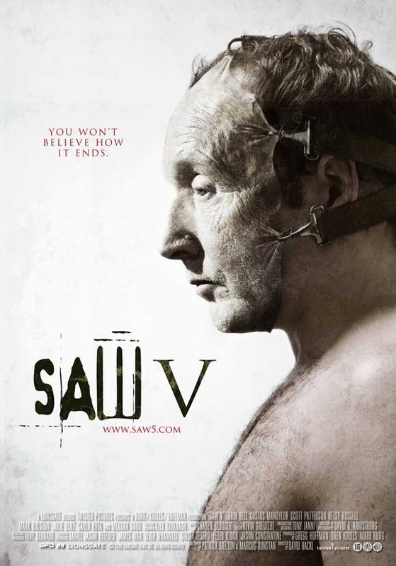
Probably one of thee best examples of CMC, Synergy,continuity and brand identity within the horror genre is the 'SAW ' franchise with a total of 7 films the films directed by James Wan, Produced by 'Twisted Pictures' and distributed by 'Lions Gate Entertainment', grossing a collective total of over $870 million on a budget of only $48,000,000, this franchise boasts one of the most successful horror franchises of all time.
|

|
|
|
|

|

|
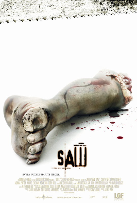
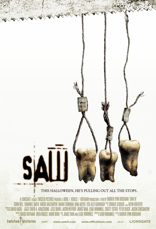
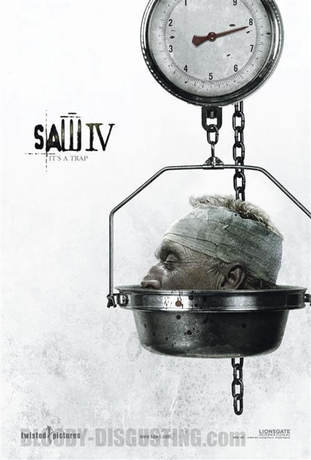
Looking at the posters for some of the saw franchises movies you can see continuity and brand identity clearly. Everything is very consistent and a lot of similarities can be found for the posters one of the main similarities I found were the colour white and the images which have been given a kind of grunge texture overlay, these things have been used very consistently within each of the movie posters. Another one of the main aspects of continuity is the typography used. The typography is custom made for the movie and is very unique and distinct it gives a sense of horror and therefore correlates with the movie genre. It's also consistent within everything to do with the 'SAW' franchise for example 'SAW' the ride at thorpe park which uses the same font on its signs. With all the money the SAW franchise has made it's not really a surprise how much it's expanded over the years to the point it's at now with so much merchandise related to it

|
Another example of continuity on different forms of media is on the blu ray cover of the saw one movie as you can see a similar concept to the poster for the first movie is used on the cover but instead of just a foot this time it's a foot and a hand these relate back to the torture elment of the movie. Also the colour white and the same grunge texture I mentioned earlier are used again for the blu ray cover. The same typography is also carried onto the blu ray cover and all around it has a very similar feel to the movie posters this all ties in to the brand identity.
|
|
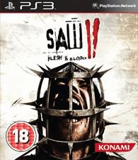
The next platform where I can see continuity is used is in the 2 video games that have been created based on the movies created by Japanese company KONAMI. Looking at the cover the first game entitled 'SAW: The Video Game' I can see that the same font is continued onto the cover, this font seems to be a recurring factor in all of the SAW merchandise. On the cover I can also see one of the most iconic elemnts of the saw movies which is the character 'Jigsaw' with a grunge texture to his face who appears in all of the movies. Looking at the second game entitled 'SAW II: Flesh & Blood' again the same font is used again. On the cover of this one they also decided to use the white background which adds continuity relating back to the posters. The image they used also relates back to the torture elemnt of the movies.
|

|
|
|
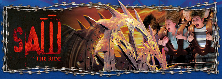
The final thing I'm going to talk about for the SAW franchise is the actual rollercoaster which currently resides in the 'Thorpe Park' theme park in Surrey, the park has also implemented a SAW: Alive live action maze into the park. Looking at this sign they have used once again the same font as every other product/ piece of merchandise I have looked at for this franchise. Their is also a barbed wire border whbich relates again back to the torture element of the movie. At the actual line for the ride their is also a barbed wire theme.
|
|
|
|
|
Looking at the trailers for the seven saw films you can clearly see that continuity seems to be a constant factor with the 'SAW' franchise. Looking at the trailers you can see they're not very bright and a lot of low key lighting is used within them. This is normal in most horror movie trailers as it gives the trailer a dark feel to it and sets the mood. Another thing that I noticed is that throughout the trailers the image of one of the main icons of the film is consistent within most of the trailers, A similar voice is also heard throughout the trailers which is made out to be Jigsaws voice this also shows continuity and brand identity. Looking at the captions they seem to be quite consistent using a serif font. Lastly within these trailers there is a constant theme of torture things such as barbed wire and weird contrapments this goes well with the theme of the 'saw' franchise being torture/ horror.
Paranormal Activity
Another franchise within the horror genre that uses CMC , brand identity, continuity and synergy to good effect is the 'Paranormal Activity' franchise originally created and directed by Oren Peli and distributed by 'Paramount Pictures' this franchise grossed an impressive total of $371,200,191 on a budget of over $18,000,000
|
|

|
|
|
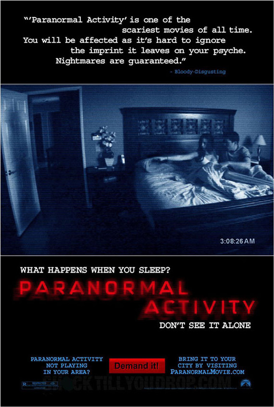
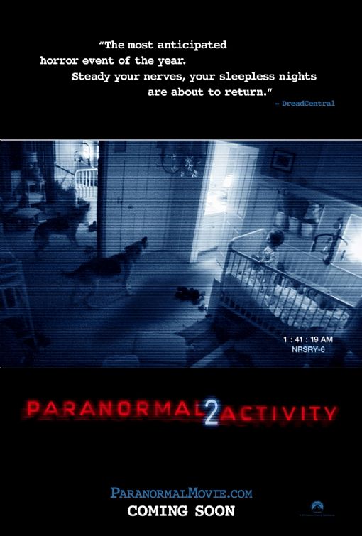
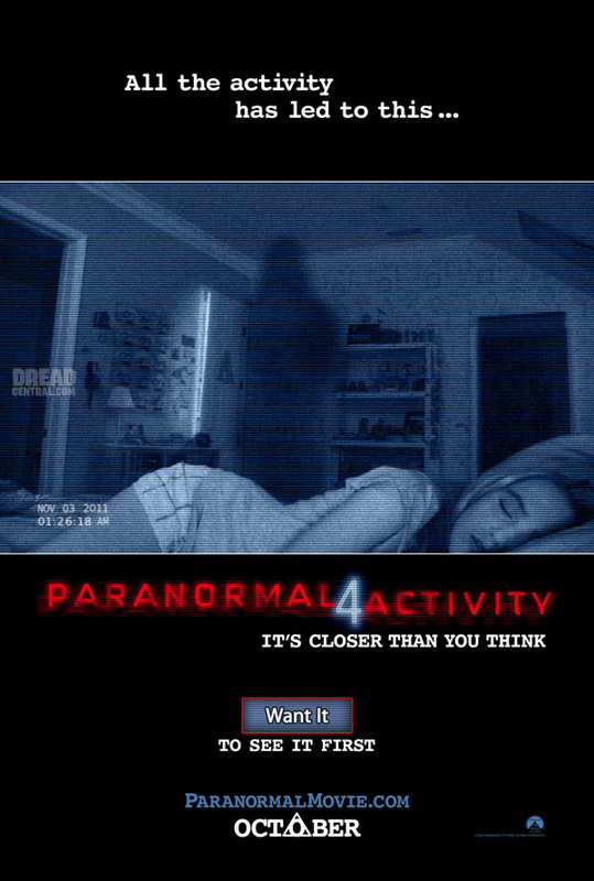
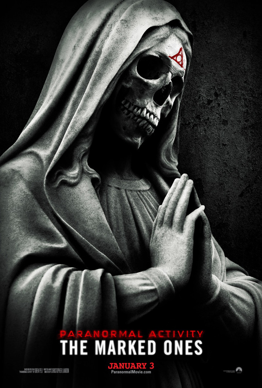
Looking at the posters for these movies there is a clear correlation between them and they're very consistent in the way they have been designed. I noticed that on all the posters their is a black background.This may correlate back to the theme of the actual movie being a supernatural film where most of the horror aspects occur in the darkness or night time. Another thing is the red sans serif font that has been used throughout all of the 5 posters it gives it an LED kind of effect. The main image on each of the posters is an image/ scene within the movie, the images also look like they were filmed on a camera this also relates back to the fact that the majority of the film is in the style of a camera filming the supernatural events that take place. The only one that seems to have a different look to it is the most recent of the posters this may be due to the fact that it's not directly linked to the series and so they may have wanted to give it a unique look

|
Looking at continuity on different media platforms this can be shown in the paranormal activity franchise by the blu-ray cover for the first movie. This is very similar to the poster for the first movie. Some factors that are consistent are the black background which is carried on in both platforms. The same image is also used in both the poster and the blu ray cover. The last thing is the font which is also the same, although the placement of the typography has been changed.
|
|
|
|
|
|
|
|
Looking at the trailers for the paranormal activity films the first trailer seems to take a different approach to the rest using a real life audience at a cinema's reaction to snippets of the film,this is a technique trying to show the potential audience that the film is actually scary and not just a flop. Although they decided to take this route there is still continuity in it as parts of the film can be seen. Within all of the trailers and the films except for the most recent of them the scenes seem to be shot through a night vision camera this shows continuity through the films and the trailers. Another thing I noticed within the trailers was the quite frequent use of static this also relates to the fact it's shot on a night vision video camera. Also within the trailers a similar font is used between them, from what I can see it's a typewriter style font and is quite effective.
RESIDENT EVIL
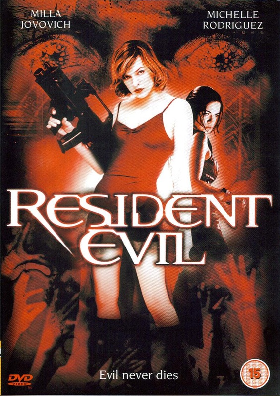
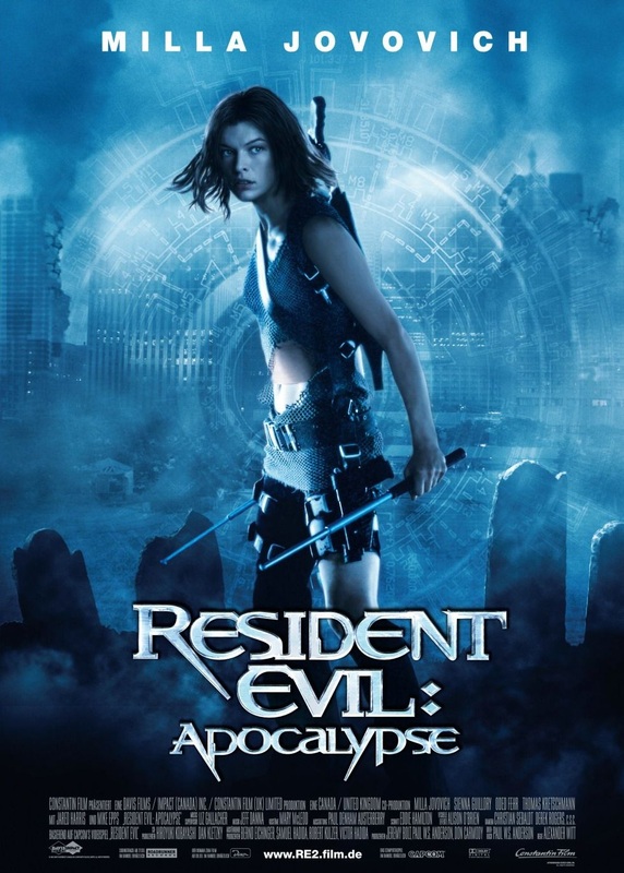
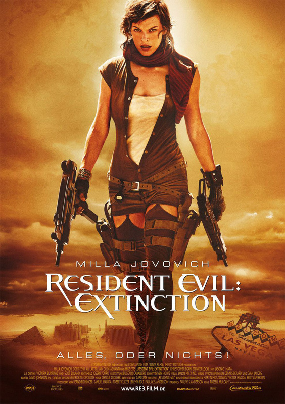
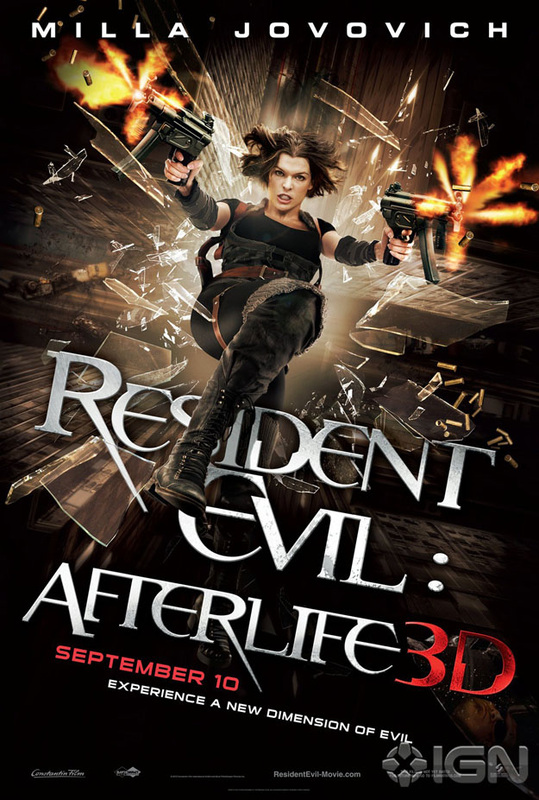
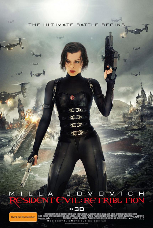
A third example of a franchise that uses CMC, Synergy and continuity to good effect is the 'Resident Evil' franchise. The franchise which consists of 5 films with a sixth installment set for a 2014 release was based on a video game made by CAPCOM . The films distributed by 'Screen Gems' grossed a total of over $915,000,000 on a collective budget of around just $248,000,000.
|
|
|
|
|
Looking at the posters for all of the films continuity is very easy to identify looking at the typography within the posters you see throughout all five of the posters they have a similar/ the same font this font seems to be a custom font and not generic this isn't very rare in big budget films, also all of the typography for the title of the film are silver with a slight shine except for the most recent of them all. This may relate to the weapons/ guns she uses being metal or having metal bullets. Another thing that's consistent in the posters is the main actress Milla Jovovich who is in all of the resident evil films this builds her fan base and allows fans of the franchise to build a bond with her character meaning the franchise will gain more potential fans. The last thing I noticed with consistency was the fact that within all of the posters a weapon is present in the main characters hand.

|
The video game series for this franchise has evolved and kind of become it's own entity away from the movie element becoming a survival horror genre game, despite this the video game series has still been a convincing success being one of Capcom's biggest ever franchises. Looking at the cover for the game 'Resident Evil 5' you can see right away that there is a difference in the way it looks.The video game series has seemed to shy away from using the same custom typography and instead has used a kind of generic serif font , this also relates backto what I said prior to this about the video game series taking on it's own entity. Looking at the background of the case you can still see quite a big horror influence in the way it's designed.
|
|
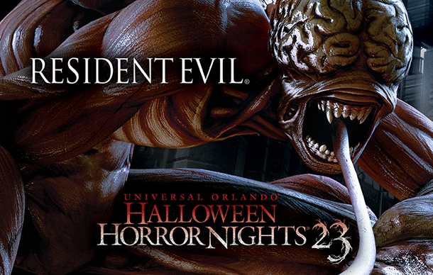
Each year Universal Orlando put together a collection of haunted houses and horror attractions. Resident Evil game producers Capcom consulted with Universal in the end they came up with the main event at the 23rd annual Halloween Horror Night main attraction being based off of the Resident Evil game series featuring the monsters and zombies from the series. This shows just how much the franchise is expanding as a whole and forming bonds with other companies to help them grow.
|
|
|
|
|
|
Looking at the trailers for Resident Evil I can see the trailers are all consistent in their themes being a 'Zombie Apocalypse' horror film all of them include monsters or zombies within them this is one way of trying to show continuity. Another thing I noticed within all of the trailers is that they are all centered around the main character played by 'Milla Jovovich' this shows the franchise trying to build the brand identity around her by consistently using her as the main protagonist. I also realized all of the trailers include the name of their respective film in the same custom resident evil font this shows continuity in the trailers and the posters which this relates to.
Continuity & Brand Identity Between Our Main Products
Trailer & Poster

|

|
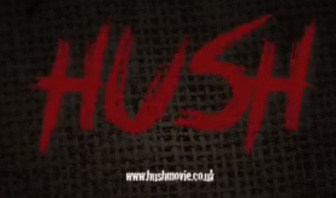
Looking at our poster and trailer we tried to be consistent in what we done and add continuity we used a few methods to do this one thing we done was use the same font consistently within all our products. The font we used was called 'Crime Time' and I believe we have used this font to good effect as the font is reminiscent of blood it's also red which also connotes blood and murder which relates back to our sub genre 'Slasher'.
Poster & Magazine

|
|
Looking at our Poster and magazine you can see clear continuity in the font we have used for the name of the movie 'HUSH'. We've used this font in every product we have made with the movie title included. This is a clear example of brand identity and continuity in all of our products
|

|
Comparing the Poster and magazine one of the consistent elements of them is the colour them which is red and white. We chose these colours as they complement each other very well and also have a covert meaning. The red we used connotes blood and danger which again relates back to our sub genre which is slasher. Another thing you can see when comparing the two main product is that the character remains consistent on both platforms, as you can see the two images on the poster and magazine are of the same person in the same mask. This shows continuity in our main products.
Magazine & Trailer
|
|
As you know already we have used the same font in all of our products for the film title 'HUSH' so it's no surprise that comparing our magazine and trailer this is something that shows continuity and consistency.
Brand Identity
Branding a franchise correctly is very important and is one of the biggest factors in creating a successful long standing movie franchise such as 'Harry Potter' and 'Star Wars' using brand identity can make or break your movie franchise. Things such as using good avertisement and expanding your brand is vital using different platforms that appeal to your audience, an example of this isTV adverts with well known and loved celebrities can significantly boost your fan base dramatically and so although they may seem like little they are very big things to companies such as Virgin Media who are currently using Usain Bolt in their comedic TV adverts. Looking at a company such as warner Bros. on all of the things they produce their logo will be on it also at the beginning of a film they are involved in somehow their logo will come up with the same music which has kind of become iconic in film culture. The main factors in brand identity seem to be Typography & Name this is why we had to carefully pick out the font we were going to use and the name of the film.
|
|
|
The above three images are all examples of a successful brand identity. The majority of people who look at these fonts even without them having the name of the movie will recognise the film straight away these films have used typography in extremely successful ways and have benefited greatly through it being some of the most iconic films in history.
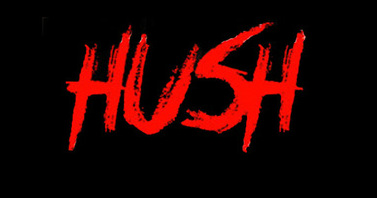
Looking at all of our products and advertisement we have used the title 'HUSH' in the exact same font and for the most part the same colour this shows continuity in our products and franchise. This shows we are also trying be consistent to build a strong brand identity .
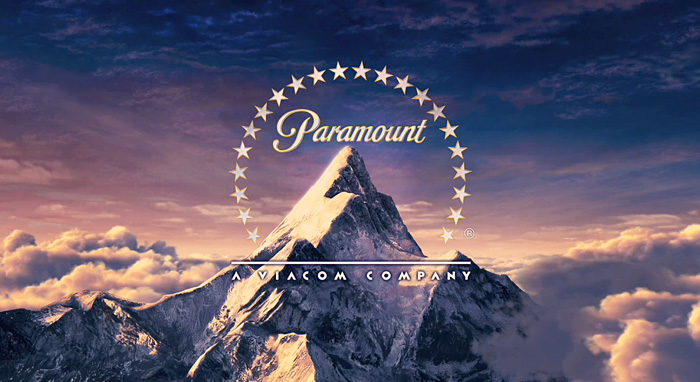
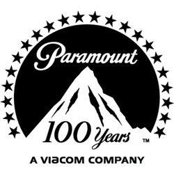
Brand identity is important in all aspects of media and so it's important that the productiuon companies also show and use brand identity in what they do. A logo is very important to a big production company and to make sure you're company are out there it's important the logo is memorable, very distinct and relates to the name of the company in some way or another whether that be a item that relates to the name or just the logo of the company. It's important the logo is also versatile and can be used on platforms other than just films and animation rather it's best to have two or more different versions of the logo for different purposes, such as paramount pictures who are part of the 'Big Six' production companies. They have one logo which is used for things such as movies and then they have the 2D version which could be used for things such as posters.
|
|
Our Example

|
|
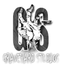
Although I believe our logo is already very versatile, I thought it would be a good idea to have an alternative logo anyway to make it seem more professional and show continuity.
CMC & Synergy Through Other Platforms

The above image is a picture of our film being advertised at a bus stop this is a good way of advertising as a lot of people commute to and from work using things such as the bus and so a lot of people will be passing by and seeing the poster at the stop. I decided to use the same poster and not change it in the bus stop as the main poster has all the required information and the image is also very eye catching and stands out.
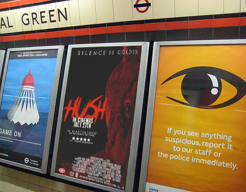
The above image is our movie 'HUSH' being advertised at a tube station. Much like the bus stop it's very busy throughout the day due to commuters going to and from work. Once again I used the same poster for the advertisement as it has everything required to appeal to passers by and will catch there eye due to the very strong red colour.

The above image is a picture of a the iPhone app for our production team on an actual iPhone. Having an app is a good idea to promote an upcoming film as it allows users new and exclusive information about the movie and rather than having the app just dedicated to the one movie it's better for the production company as it allows the users to find out about other movies they may be producing.

The above image is a picture of our propsed website as you can see we have a colour scheme on our website (Red & Black) this connotes blood and danger which also relates to our films sub genre (Slasher). On our website we also have a banner for our movie 'HUSH' it has the same font as our poster, trailer and magazine which as I've said many times shows consistency and continuity within our products.

The above image is a picture of our movie as a lego video game. As you can see I have used the same font as on our poster, trailer and magazine this shows continuity and brand identity with our products. I decided to use the lego concept because Lego is a very big company and have produced games for some of the biggest film franchises in the industry such as 'Pirates of the Caribbean'. 'Batman' & 'Harry Potter'. I only decided to use half of the face this is also something we did in the poster, this also shows continuity.

The above image is a picture of our film 'HUSH' on Netflix. Netflix is a subscription based website where you can instantly stream films from it's vast collection. I chose to use Netflix to advertise our film as it is a very successfull service that in recent years alot of people have been signing up, subscribing to it and using it. The image I decided to use is the same as the posters although I took away everything but the title around it. This is because all the others around it are similar to that and so i came to the conclusion it wasn't very helpful and would only complicate the Netflix subscribers.
